10 Round Label Designs from Customers that Inspire
Coming up with ideas for round labels can be challenging. Labels need to reflect the brand’s identity, while ensuring that the design is unique enough to catch attention. That's why we've provided a list of ten of our favorite designs our customers have submitted to our customer ideas gallery. Whether you're looking for inspiration or want to change your logo, these examples will help you to get started.
Body Mousse by Angie M Mellen
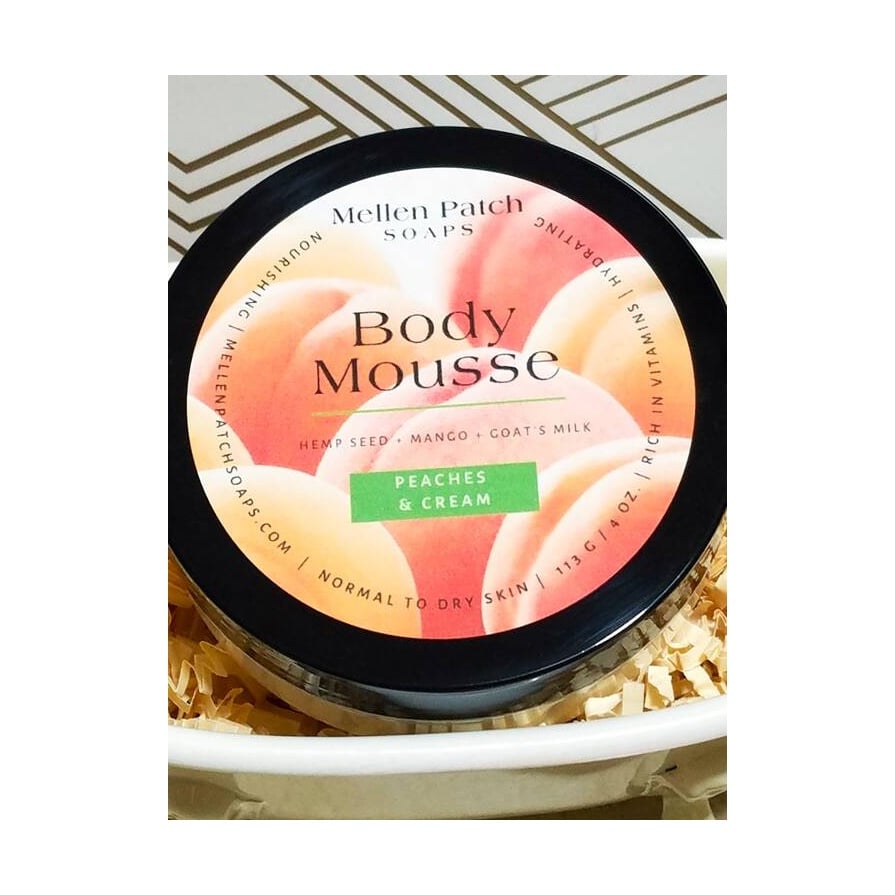
One of the benefits of round label design is that it provides a visually pleasing aesthetic look. As seen in the label by Angie M Mellen, the circular form of the label can enhance the perception of color, making it more attractive and eye-catching.
This design makes great use of the round shape by centering the product name and incorporating the ingredients as a border.
Labels featured: OL2279, 3" circle labels, Standards White Matte.
Healing Honey by Allison
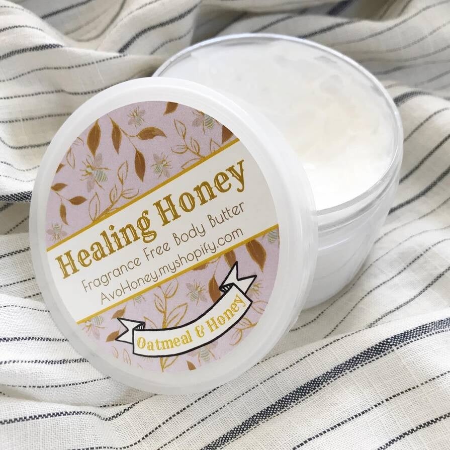
As seen in this logo design by Allison, the shape of the label allows for proper color use, making the purple of the background work as a complementary color for the yellow title.
This allows for better brand recognition since it helps the audience associate specific colors with the brand and creates a cohesive visual effect.
Labels featured: OL2279, 3" circle labels, Weatherproof Polyester.
Minimalist Balance by Shernette Duncan
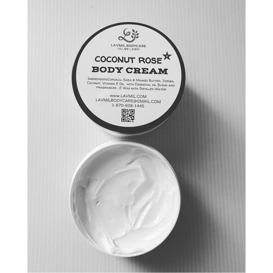
This design, created by Shernette Duncan demonstrates how round labels produce a balanced canvas for displaying black and white. Its shape can be used strategically to highlight key information or elements.
The circular shape draws attention to the center of the label, making it an ideal location for important ingredients, and information such as QR codes as seen in this design.
Labels featured: OL172, 3.75" x 3" circle labels, Standard White Matte.
My Beauty Fetish by Sasha Bamberg
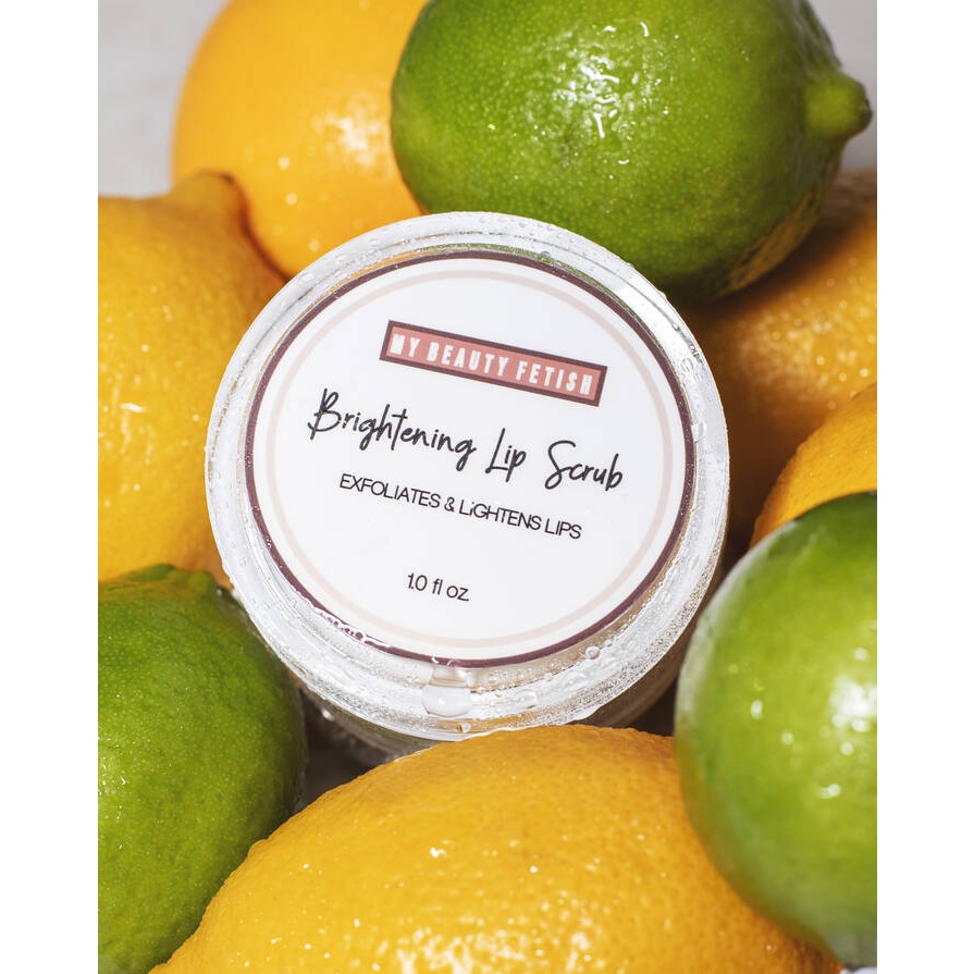
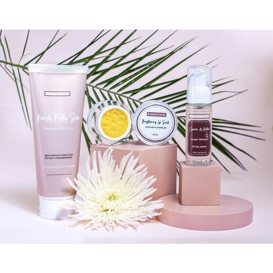
The design by Sasha Bamberg showcases how round labels can be adaptable. This product line comes in different sizes and round labels are elements that can work to adapt to any type of information. In this case, the label succeeds in featuring the main logo of the brand as well as important ingredients.
Labels featured: OL350, 2.5" Circle labels, Weatherproof Gloss Inkjet.
London Marie by Vanessa Villarreal
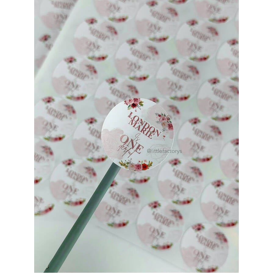
This concept by Vanessa Villarreal demonstrates how round labels can adapt to any size and logo. This tiny logo design is 1”, but does an excellent job utilizing space-balancing elements like colors, fonts, and size.
Labels featured: OL175, 8.5" x 11" circle label, White Gloss Inkjet.
Simon Said Candles
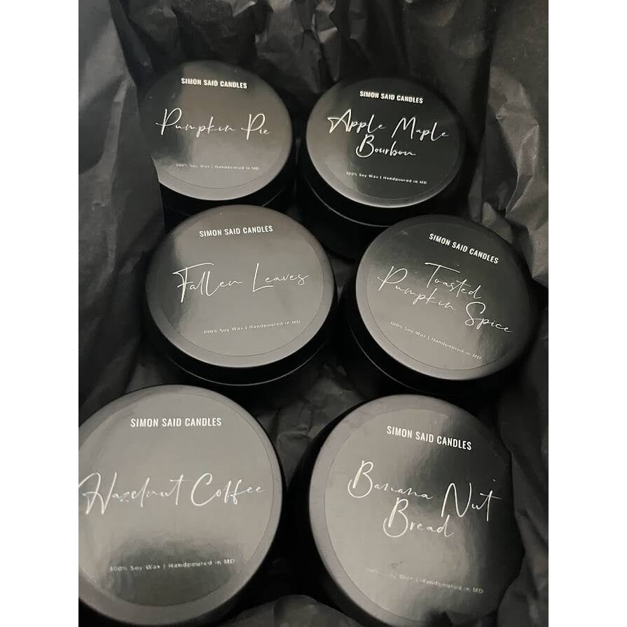
This design is made by Simon Said Candles, a wax melt business owned by a single mom. The use of colors in this label helps to blend perfectly with the colors of the products’ containers. It not only provides a minimalistic look but also makes the main information stand out more. This produces a calm and effective way to display information.
Labels featured: RL2788, 2" circle label, White Gloss Inkjet.
Gorgeous and Reliable Stickers by Noey Goodnight
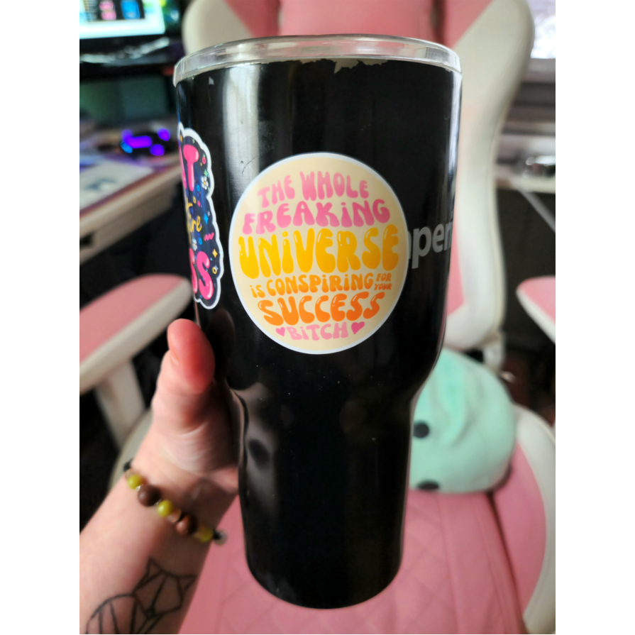
This customized design by Noey Goodnight demonstrates the perks of a round shape. The shape provides movement, which creates a balanced and fun way to present a positive message. The use of materials also makes it resistant to any type of environment.
Labels featured: OL177, 8.5" x 11" circle label, Weatherproof Gloss Inkjet.
Tin Shed Farm by Jill Franke
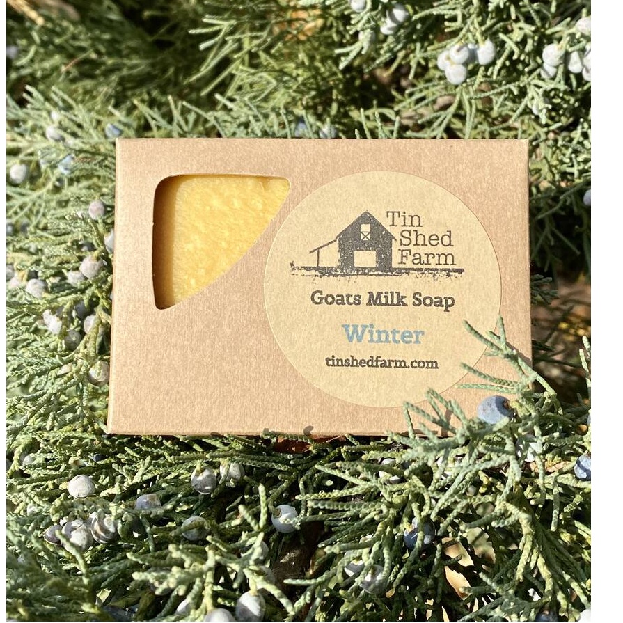
This design by Jill Franke has a very professional use of brown kraft label material, which helps the label blend with the colors of the package. This simple and minimalistic look helps the main logo stand out more, and the color of the package helps as a complementary color to highlight the type of soap displayed.
Labels featured: OL5375, 2" circle label, Brown Kraft.
The Balm Dry Skin Treatment by Lisa Braun
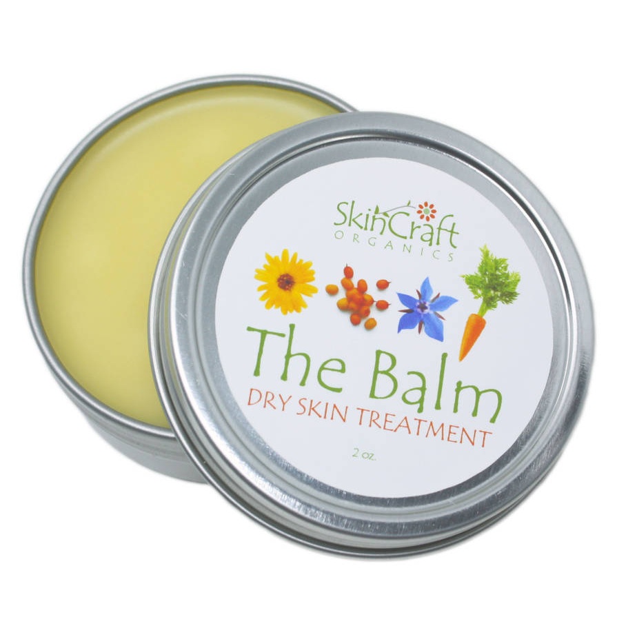
The same concept is applied in the design by Lisa Braun. Round labels help to highlight color and objects in a label. In this design, the shape helps to draw attention on the main elements as well as to the main logo “The Balm.” This helps to highlight the main message and portray the elements with balance.
Labels featured: OL5375WJ, 2" circle labels, Weatherproof Matte for Inkjet.
Duke Program in American Grand Strategy by Ashley Baldwin
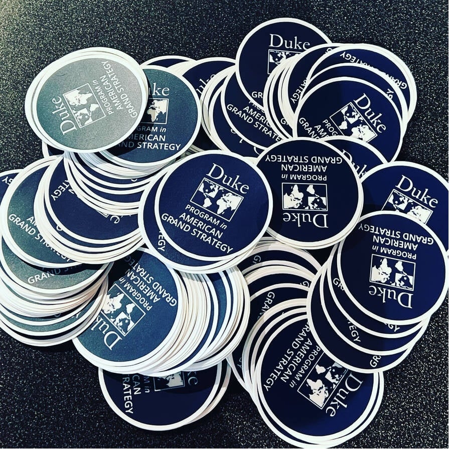
This label was designed by Ashley Baldwin in collaboration with Duke University's Program in American Grand Strategy. The round design of the label provides visual focus, and draws the attention and consciousness in the main logo.
Its waterproof material also helps the label in difficult environments. Perfect for any occasion and for longer durability.
Labels featured: OL177, 8.5" x 11" circle labels, Weatherproof Gloss Inkjet Labels.


