Best Customer Ideas of 2024
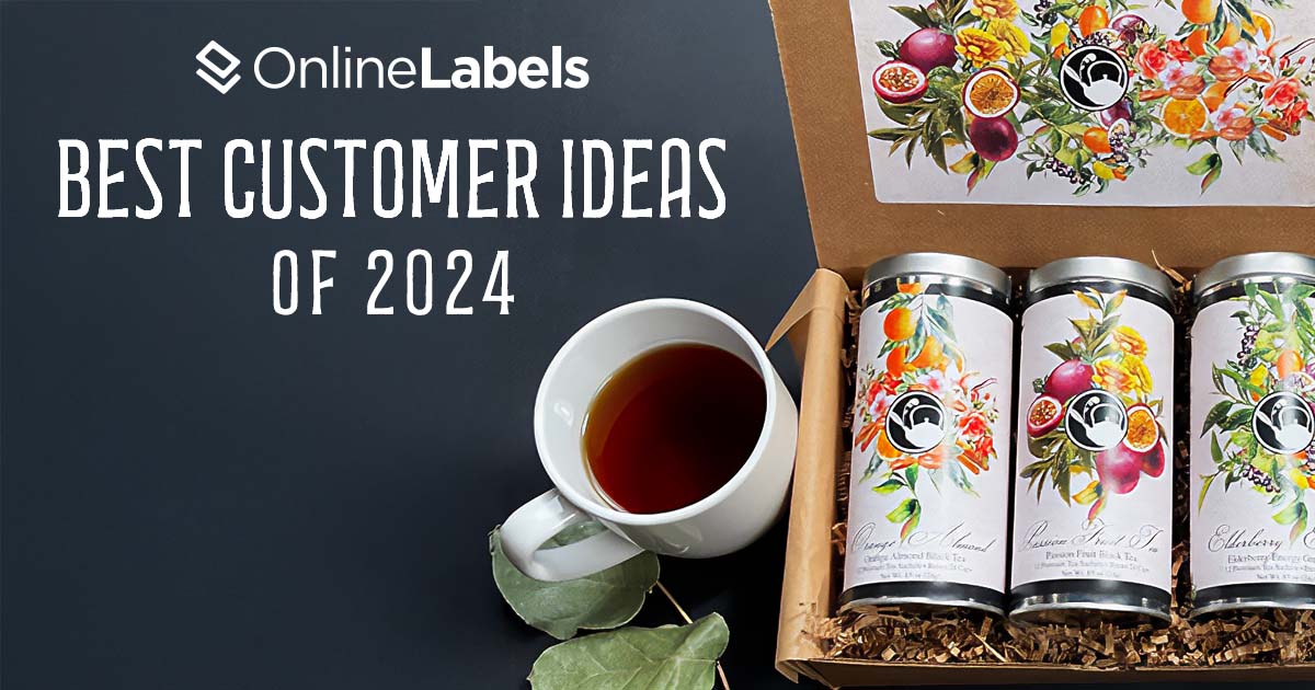
This year, our customers submitted hundreds of creative label designs, from candle labels to hot sauces and lip balms. As 2024 ends, we want to present our picks for the top customer designs based on creativity, use of design tools, and appeal. Join us in celebrating the start of a new year by revisiting the most memorable and inspiring designs of 2024.
Criteria Considered When Choosing Designs
A well-designed label captures attention, establishes trust, and leaves a lasting impression on consumers. Through the strategic use of color theory, impactful typography, and thoughtful design elements, labels become more than just packaging. They tell a story, communicate value, and create a meaningful connection between the production and its audience.
We looked at the following criteria when choosing our favorite Customer Idea submissions:
- Cohesion with product and purpose: does the label accurately reflect the product type, quality, and target market?
- Imagery and illustration: are graphics or illustrations on the label relevant to the product? Are they visually appealing
- Correct use of color palette: are the colors harmonious and aligned with the brand's identity? Do they evoke the right emotions or brand associations?
- Typography: are fonts readable and well-balanced, and do they reflect the brand's personality?
- Layout and composition: does the design have a clear hierarchy, with elements arranged in a balanced and intuitive way?
- Brand integration: does the label align with the brand identity, including logo placement and consistent visual language?
- Functionality: is the design practical for its purpose, such as clear legibility of product details and compatibility with the packaging shape?
Favorite Customer Ideas for 2024
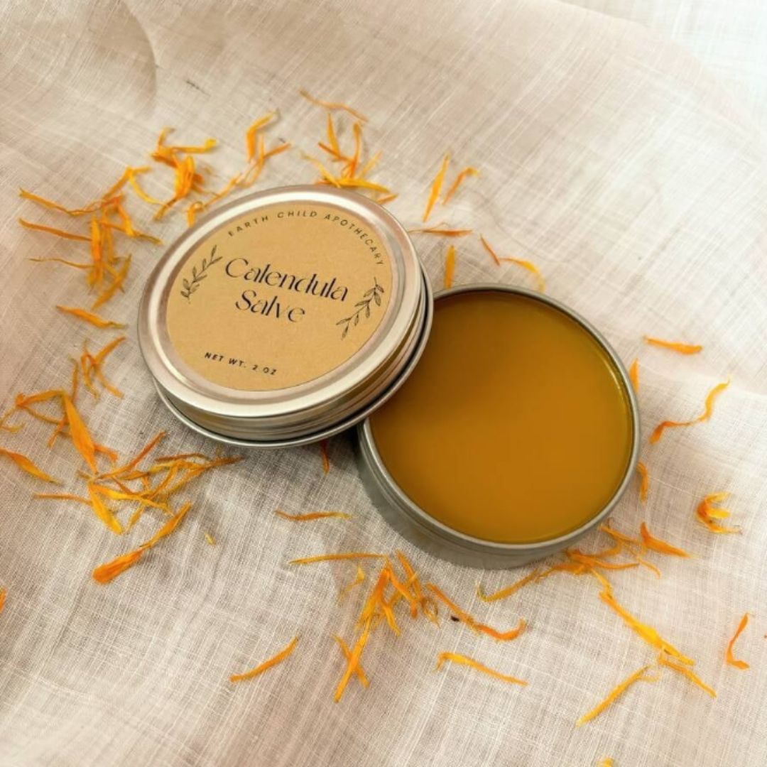
Calendula Salve by Alyssa
When it comes to Brown Kraft designs, balancing simple fonts and colors can be challenging, especially because specific ink colors are difficult to see on the material. However, Calendula's label balances the brown color to show warmth and authenticity. Additionally, the thoughtful selection of complementary design features such as crisp typography, subtle accents, and a limited color palette ensures the overall aesthetic is uncluttered yet visually engaging.
The label's minimalist approach shows its elegance, with clean curves and precise spacing creating a sense of harmony for the whole label. This can be considered a subtle yet impactful element, but it helps capture attention to the products' timeless, effortless appeal, making it the perfect example of a thoughtful design.
Product Used: OL350 Brown Kraft
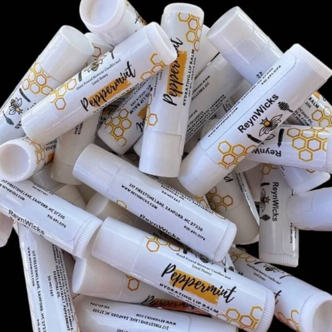
Peppermint Lip Balm Collection by Jhane Mecimore
This peppermint lip balm collection secured a place on our list due to its excellent material blend and creativity. The weatherproof gloss label ensures the products withstand weather conditions without removing clarity or visual appeal. The glossy finish not only protected the design but also improved the vibrancy of the yellow tones, making the text and icons stand out with added depth and creativity. This durability allowed the designers to explore intricate, eye-catching details in typography and color, resulting in a visually striking and highly practical design.
Product Used: OL1102 Weatherproof Gloss Inkjet
Wildflower Wickery Candle Labels by Abby
Wildflower Wickery candles captivated the eye of our graphic experts due to their simplicity and good handling of the design elements. In this composition, the design's focal point was highlighted using typography, which effortlessly guided the viewer's gaze to the central element: the candle’s scent. Additionally, the glossy finish helped accentuate the curved text's direction, drawing attention to the message while maintaining its balance. The minimalist approach also balanced negative space with the aligned text, creating a harmonious flow among all elements. This thoughtful hierarchy puts this design on the top 10 list for a perfect accomplishment of graphic design elements.
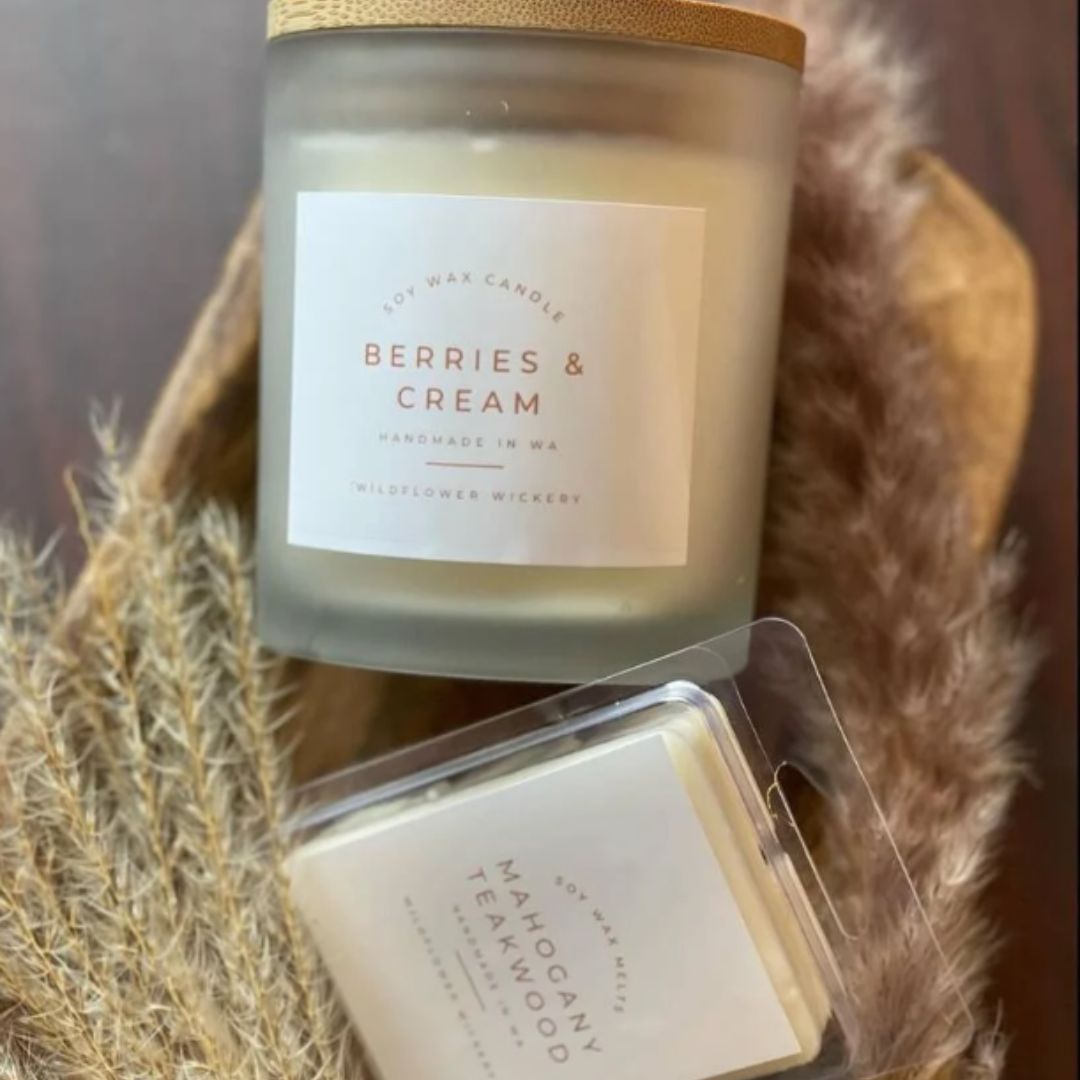
Product Used: OL675 White Gloss for Inkjet
Take Me to Stars Hollow by Hayley Kopp
The Gilmore Girls-inspired Take Me To Stars Hollow candle gift set uses weatherproof gloss labels to significant effect.
The labels were designed to significantly impact the gift set label on top, and the candle lid labels underneath. The chosen colometry added depth and elegance to both label applications, drawing attention to the logo and creating a visually cohesive set. The gradient's soft yet striking transition ensures the designs are eye-catching without being overwhelming. Paired with different typographic fonts, the labels achieved a harmonious balance, where the text enhanced the gradient backdrop seamlessly.
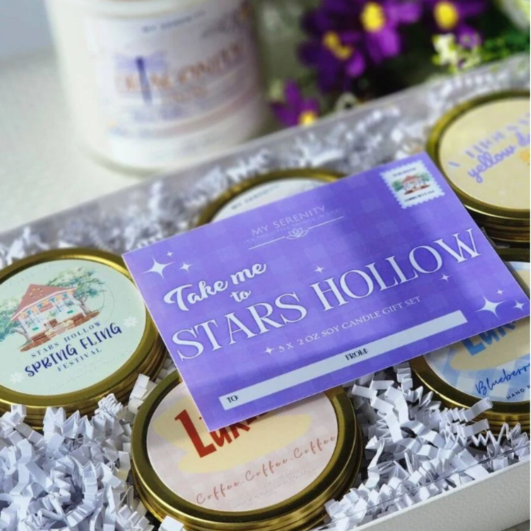
Product Used: OL177 Weatherproof Gloss Inkjet
Sugar Plum Goat Milk Lotion by Michelle Bibby
The Sugar Plum Goat Milk lotion combines visual harmony and communicates the product's essence. The soft, pastel color tones perfectly align with the sugar plum theme, evoking feelings of gentleness. The choice of typography was also impeccable. A delicate serif font balances the clean sans serif on the bottom for better readability. The minimalist layout also ensures that the essential information remains on the focal point, which is the goat, surrounded by subtle design elements like the clouds and the birds around it, enriching the composition without overwhelming the viewer. Weatherproof polyester labels add durability to the design and improve the customer experience by maintaining a professional appearance over time. This design reflects how simplicity can be memorable when paired with thoughtful details and innovative material choices.
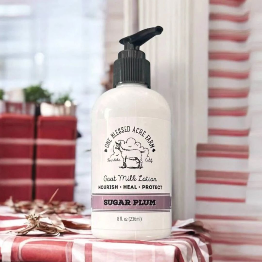
Product Used: OL5925 Weatherproof Polyester for Laser
Hot Tropic Sauce Bottle by Anthony Meyer
Hot Tropic sauce bottle earns a well-deserved spot on our list of top designs for 2024. This label design has the perfect balance to capture its content's fiery and exotic essence. The vibrant color palette, mainly focused on warm reds, yellows, and greens, perfectly portrays mountain-inspired elements such as mountains, peppers, and fire. The typography is particularly what draws the eye of our designers since the bold, hand-drawn style of the product name adds a rustic feel to the product. These elements also extensively use layering and texture, giving the design depth and creating a multi-dimensional look. However, what sets this brand apart is its personality. Combining the round-shaped title, the tropical elements, and the text makes a fiery product personality that appeals to consumers seeking a bold sauce in flavor and style.
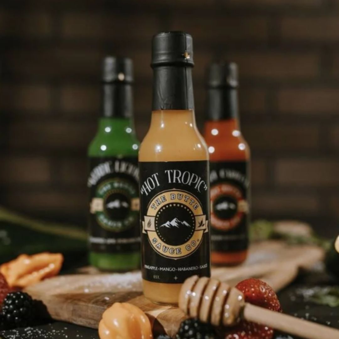
Product Used: Custom Printed Roll Labels
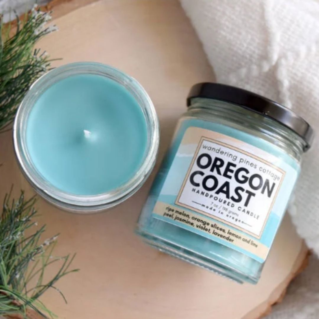
Oregon Coast Candle by Suzy Molen
Oregon Coast Candle is the perfect example of how color psychology elevates a product!
The soft, earthy color palette of blues and beiges instantly transports you to Oregon's coastal region's serene and calming ambiance. This thoughtful use of color emphasizes the principles of color psychology, where blue tones evoke feelings of peace and trust while the beige adds a sense of balance. Together, these colors create a visual harmony that reflects the soothing quality of the candle, appealing to consumers seeking relaxation and comfort.
The use of typography is also clean and understated, with a modern sans-serif font that balances elegance with readability. The placement of the text is carefully aligned to maintain balance and focus, ensuring the design feels open and uncluttered. Including subtle, illustrative elements also creates the effect of waves and coastal icons, adding an artistic touch without empowering the minimalistic aesthetic. The White Gloss material helped give the label a soft finish that complements the candle's handcrafted vibe.
Product Used: OL996 White Gloss for Inkjet
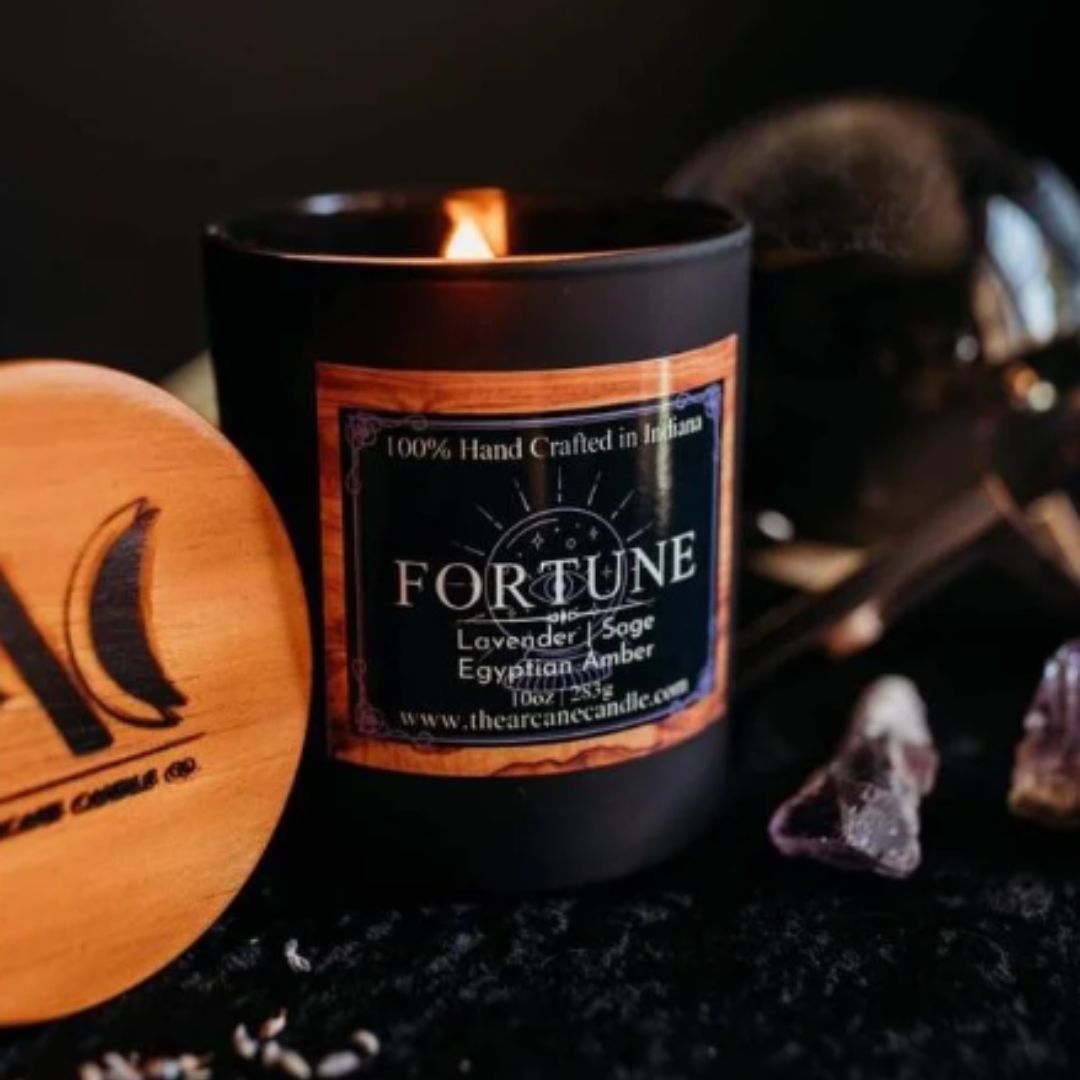
Fortune Lavander Egyptian Amber by Chad Ellsworth
Fortune's Lavander Egyptian Amber candle is on our list because of its visual storytelling. The design is a perfect example of how texture, color, and typography can work together to communicate the essence of a product. The selection of the color palettes combined with the design in the back makes the candle visually harmonious. It perfectly follows color psychology trends, using black to provide a night atmosphere and orange to evoke a sense of coziness and the Fall season. Typography also helps create an elegant ambiance, with the classic font used in the center and sans-serif on the bottom of the label. The strategic contrast between these typefaces enhances readability while maintaining a cohesive look. Additionally, the use of White Gloss provides a soft feel to the product; the gloss finish reflects light beautifully, enhancing the richness of the color palette and drawing attention to the fine details of the design.
Product Used: OL3089 White Gloss for Inkjet
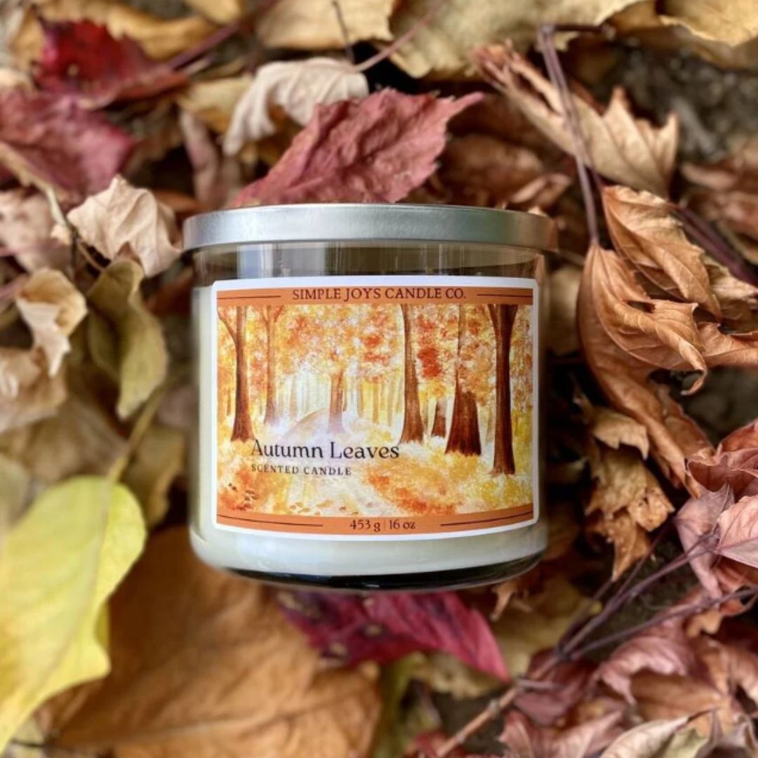
Simple Joys Candle Co by April Murphy
Simple Joys Candle Co. is the perfect example of how good color theory can help a product tell its story. The warm amber and red tones create a harmonious balance between energy and tranquility. The overall result catches the eye's attention, evoking relaxation and appealing towards this product.
The typography was equally compelling since the font used for the brand name provides a timeless look without overshadowing the main design. Additionally, the subtle interpretation of the forest helps tie the whole message of the graphic together, adding texture to the overall design. The Weatherproof Matte label material provides an opaque reflection and a polished finish that prevents the design from reflecting light.
Product Used: OL600 Weatherproof Matte for Inkjet
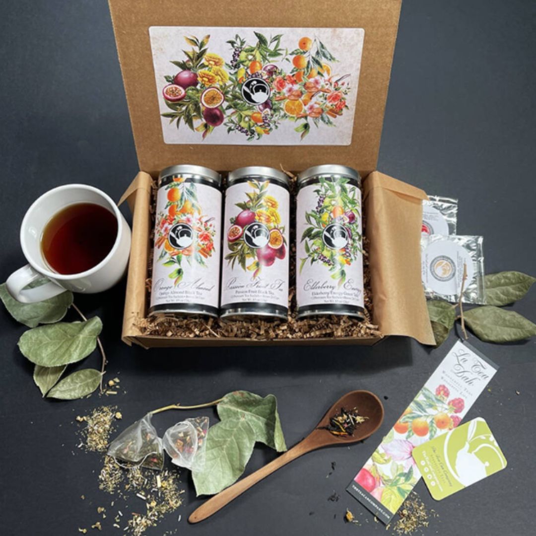
Gift Boxes and Labels for Holidays by Donna McCafferty
Finally on our list are these gift box holiday labels by Donna McCafferty!
This design captures the magic and joy of nature, utilizing a classic palette of greens, oranges, yellows, and magentas, which evoke a sense of spring and relaxation. The bright tones provide a harmonious balance without overwhelming the viewer. The colors of the fruits, in particular, add a touch of luxury, while the complementary use of white space ensures the design remains clean and modern. The typography is functional and festive; a script font gives a classic look and brings the comfortableness of the teas. Finally, using standard white matte provides a tactile vision of the product, adding a reflective quality that catches the light beautifully. This design not only succeeds at creating an inviting aesthetic but also perfectly captures the essence of the product!
Product Used: OL369 Standard White Matte
Creativity That Captured Our Eyes This Year
As we reflect on the year's most inspiring label designs, it’s clear that creativity, correct use of typography, and color theory are the cornerstones of impactful packaging. Throughout this year, each label demonstrated how to create a stunning label and tell a story to connect its audience to its products. Moving into the following year, these examples remind us of the endless possibilities in design and how our customers can do wonders with our products while staying true to the essence of their brand.


