Gloss vs Matte: Choosing the Right Clear Label

At OnlineLabels.com, we offer two types of clear labels: glossy and matte. While both materials are clear and it's only the topcoat that varies, the resulting labels are distinctly different.
Below, we break down the differences between clear gloss and clear matte labels so you can find the right option for your project.
Clear Label Top Coat Options
Gloss and matte are popular finishes that can be found across a number of industries and products, including paint, photos, screen protectors, and more.
A glossy top coat adds shine or luster to a smooth surface whereas a matte top coat is a flat overlay that mutes shine and appears frosted.
The two are virtual opposites.
When it comes to applying one of these top coats to clear labels, the differences are even more widespread. Continue reading below to see how the clarity, color depth, and application vary between clear gloss labels and clear matte labels.
Clear Gloss Labels
Clarity
Clear gloss labels are completely transparent. The glossy top coat enhances the see-through material so it looks crystal clear.
Visual Effects
The facesheet of clear gloss labels is shiny. It reflects light and colors.
Consider Color Shifts
Clear gloss labels will pop with colors and designs that appear incredibly vibrant and sharp. Consider the color of the surface. If a white underprint is not applied, specific colors may blend into the background of your container.
Avoid Overcrowding
Too much text or design on clear gloss or matte labels can distract the viewer from the main focal point of the product. Balance the elements on your label to allow for negative space work for your design.
Application
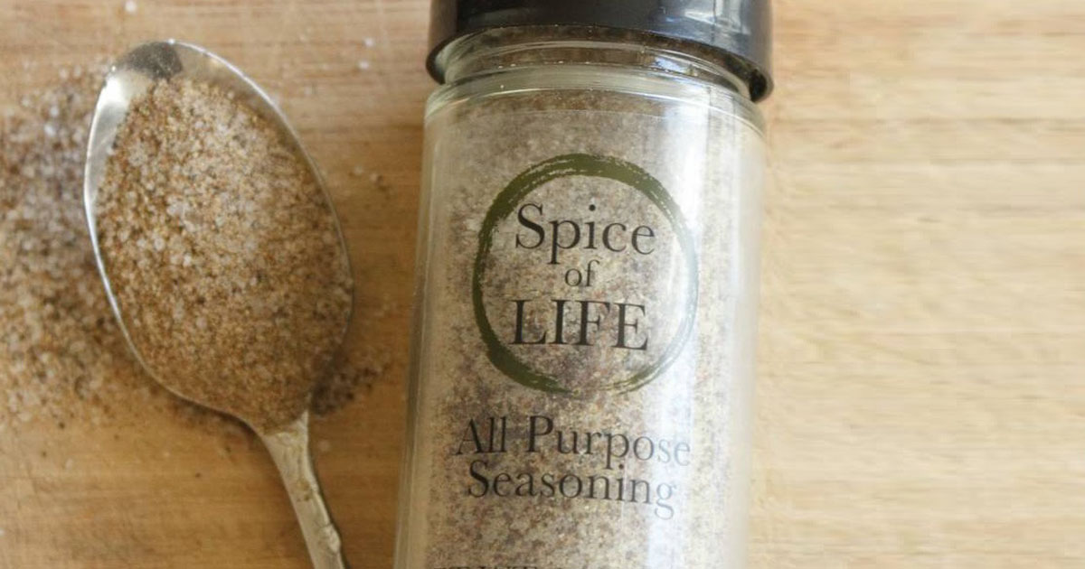
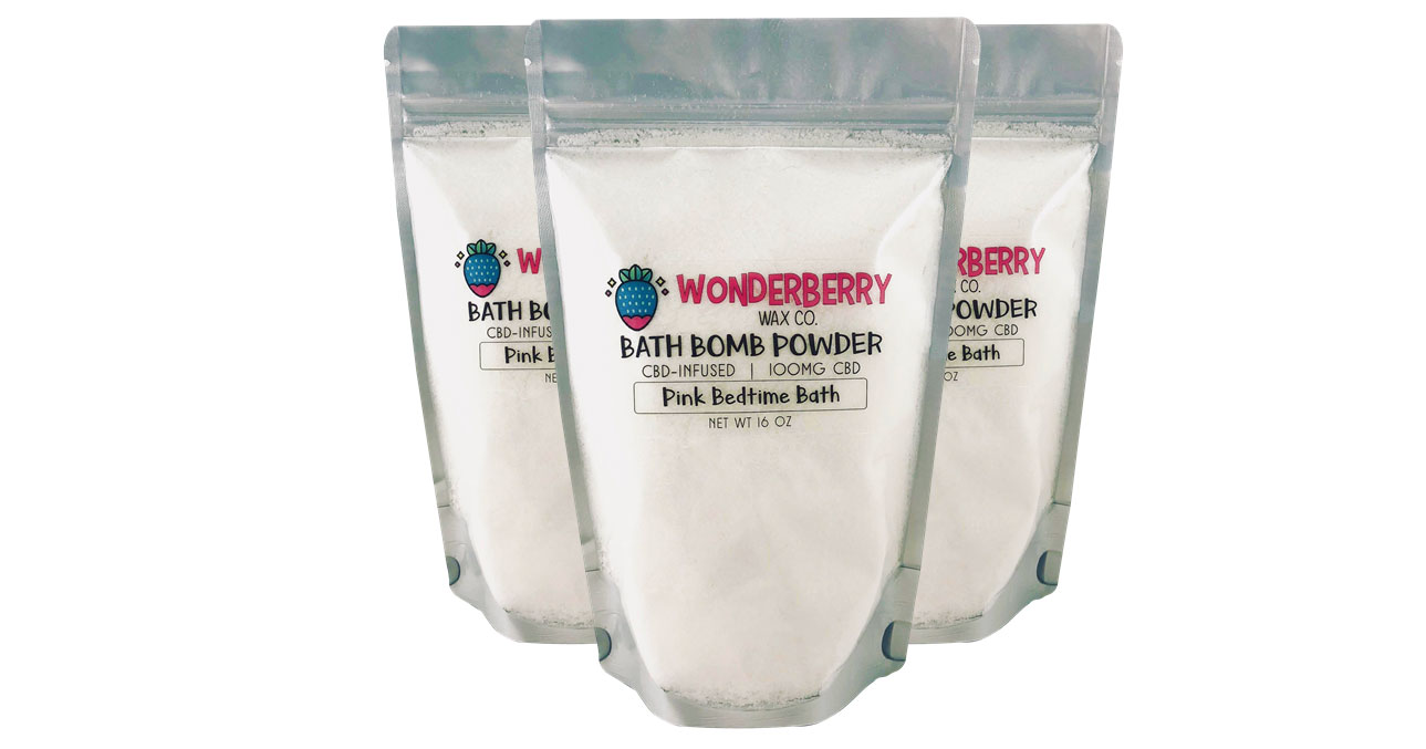
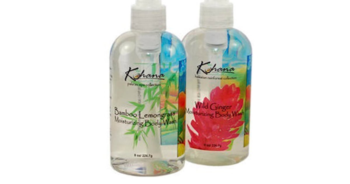
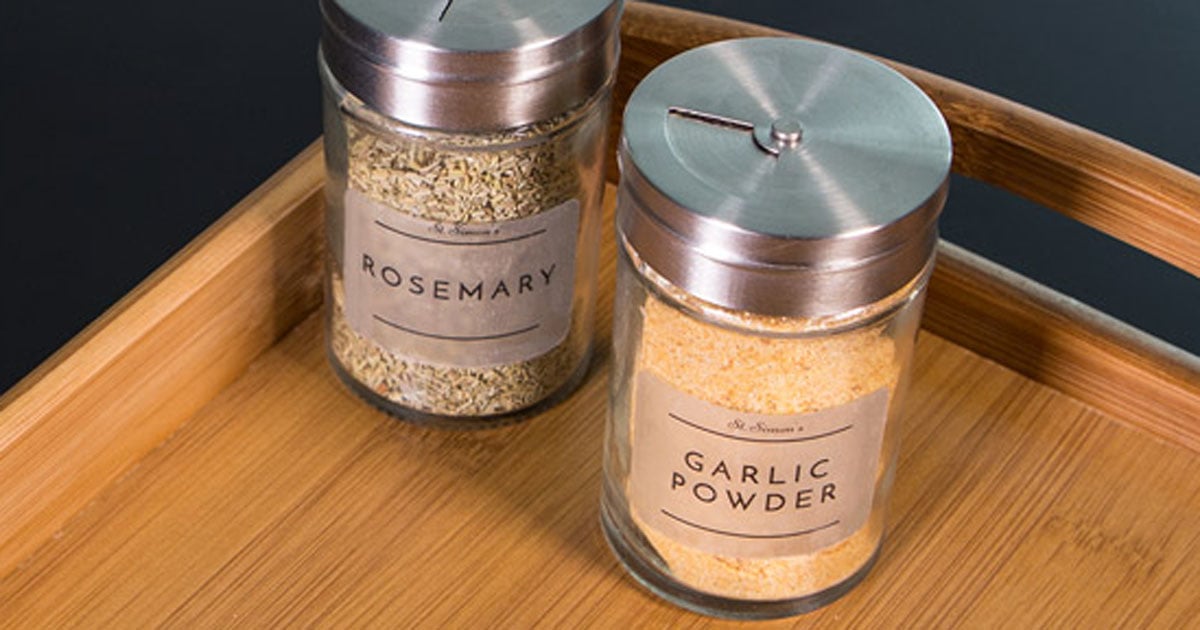
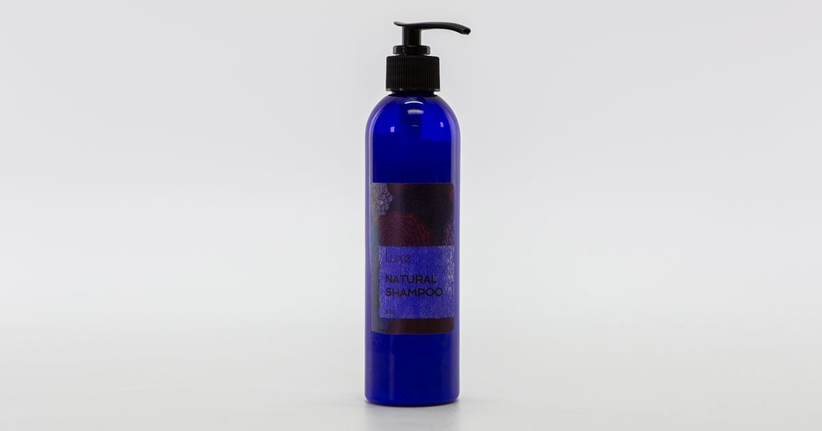
One of the most sought-after characteristics of clear gloss labels is their ability to offer a "no label look." When applied against a clear glass or clear plastic container, the label virtually disappears making it look as if you printed on the packaging itself.
Printed packaging is much more expensive than blank packaging, hence the popularity of clear gloss labels for this use.
Texture/Feel
When you run your hand across a clear gloss label, it's reminiscent of photo paper. It has a waxy, slick texture that helps create its shine.
Clear Matte Labels
Clarity
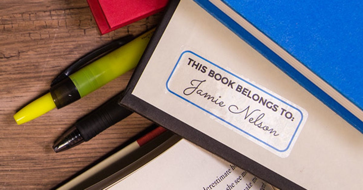
Clear matte labels appear more translucent than transparent. The matte top coat adds a frosted finish that masks the sheerness of the original material.
A comparable material would be parchment paper, often used for baking. It's clear but not transparent.
Visual Effects
The facesheet of clear matte labels is flat and non-reflective. It features a muted overlay that looks more natural than artifical.
Consider Color Shifts
Clear gloss labels will pop with colors and designs that appear incredibly vibrant and sharp. Consider the color of the surface. If a white underprint is not applied, specific colors may blend into the background of your container.
Avoid Overcrowding
Too much text or design on clear gloss or matte labels can distract the viewer from the main focal point of the product. Balance the elements on your label to allow for negative space work for your design.
Application
Clear matte labels are frequently used with containers that already feature a matte finish. They complement each other and provide a similar "barely there look" as their clear gloss counterparts do for glossy containers.
The matte texture can also help hide bubbles that the clear gloss accentuates.
Texture/Feel
When you run your hand across a clear matte label, it feels soft and smooth. Though not made of fabric, it's reminiscent of luxurious satin clothing.
Designing For Clear Labels
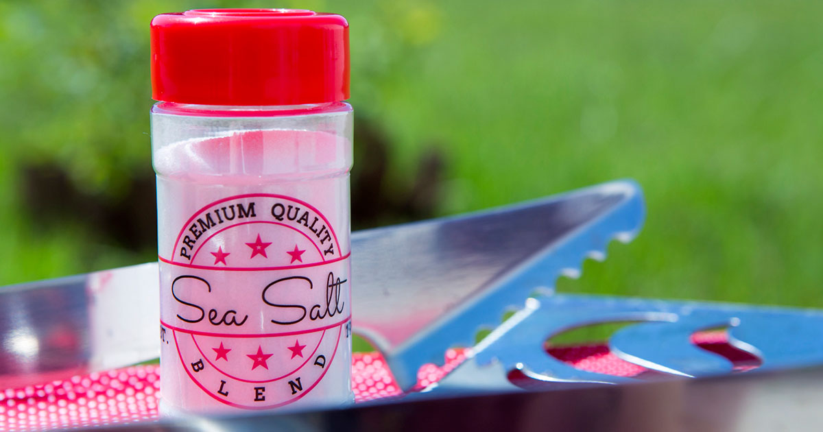
When you see clear labels in retail settings, they typically have a layer of white ink printed beneath each color. This is a technique done by printing companies so the colors appear opaque instead of transparent.
Home and office printers don't usually have that same functionality (the ability to print white ink), though. This means two things: your colors won't have a white underlay and thus will appear transparent and any white in your design won't print because your computer is registering it as the absence of color.
If you want to check your printer for white print capabilities before continuing, open the ink/toner cartridge compartment. Most printers have the standard four slots: cyan (blue), magenta (pink), yellow, and black. If your printer can print white, you'll have an extra cartridge slot. You can also check your printer's instruction manual as some printers allow a white cartridge to replace one of the original four.
If you don't have the ability to print white, take these few things into consideration when designing your labels:
- Use high-contrast colors and images
- Darken colors for additional opacity
- Be mindful of your application surface (see examples below)
Printing On Clear Labels
It's important to remember that computer screens are backlit and that Maestro Label Designer doesn't add a transparent effect to your designs. Therefore, don't expect exactly what you see on-screen when printing.
If you want to get close, follow the steps below.
- Change your print settings to "Labels" or "Transparency"
- Print a test sheet before producing your entire run
- Try changing your printer settings to 300 dpi for inkjet printers or 93 gsm for laser printers
See how label designs look without white ink on clear labels, colors, and metallics.
Applying Clear Labels
Clear labels are a lot less forgiving during the application process than our white and colored label materials. Because of this, we're often asked how to apply clear labels without bubbles or blemishes. For best results, take these tips into consideration.
Clean the surface thoroughly. Any dust or dirt particles on the surface can show through the label and cause your product to look less pristine, and thus less professional. Think of this step like applying a phone screen protector – try to avoid getting that little piece of dust stuck between your container and your label.
Wash your hands. The natural oils on your hands can leave fingerprint marks in the adhesive. Touch your label as little as possible and hold it exclusively by the edges to prevent any noticable trace.
Start in the middle. Line up the middle of your label with the middle of your destination surface and work your way out toward the edges. This prevents bubbles and creases, plus helps with long-term adhesion.
Pull your label taut. Bubbles are more likely to form if you apply the label loosely. Maintain consistent tension from left to right and with each new label you're applying.
Resist the urge to smooth it out. While it's a recommended method for applying phone screen protectors, you don't need to run your hands or a credit card over the label with pressure right after application. Over the next 24-48 hours, our labels will bond to your surface and work out the minor bubbles themselves. You may end up smearing or chipping your label design this way, too.
Check out more label application tips for all of your labeling projects.
Side-By-Side Comparisons
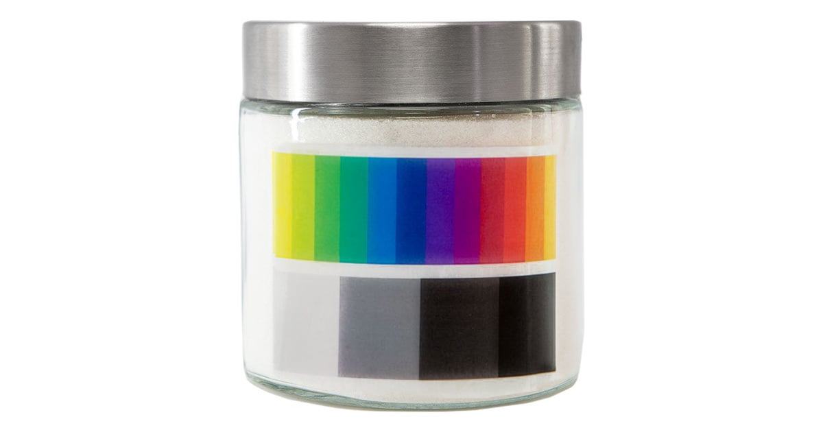
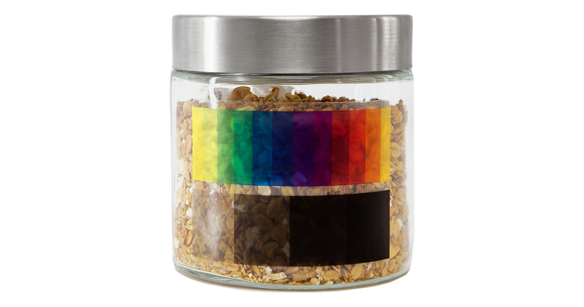
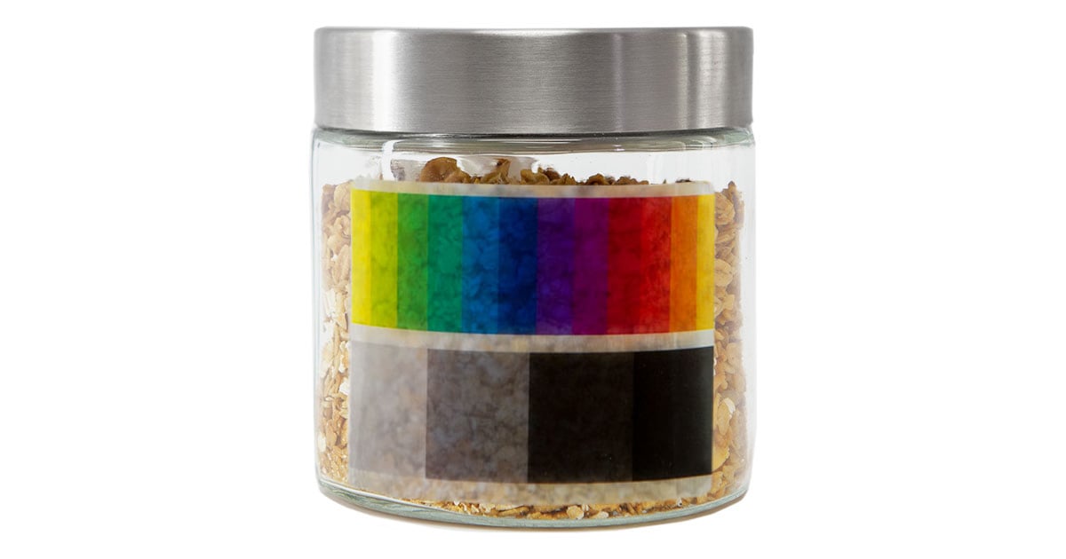
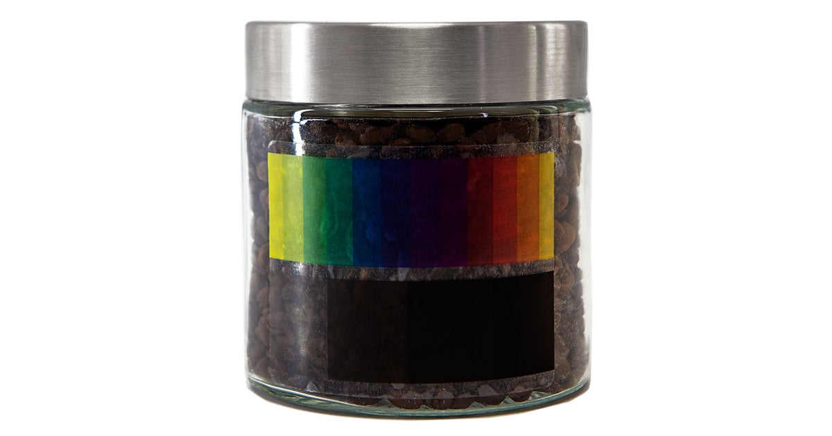
Your destination surface and the substance inside it play a large part in the final look of your label as well. See how a design can vary in different situations.
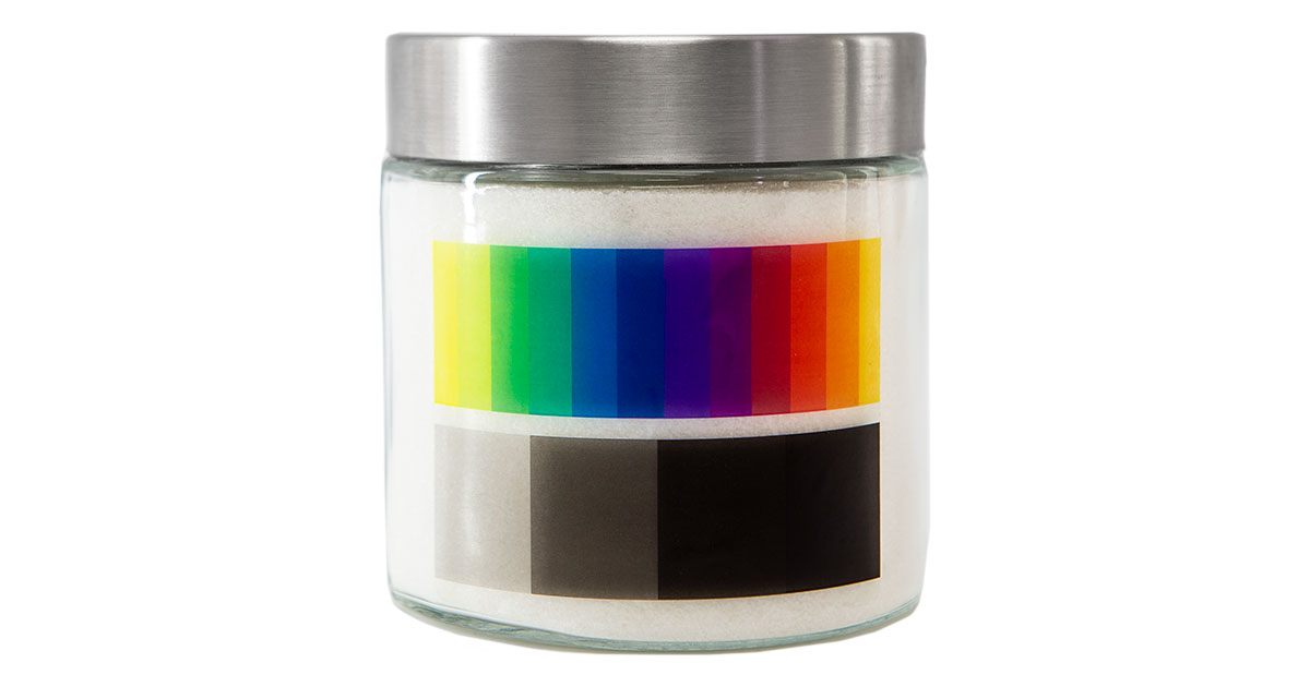
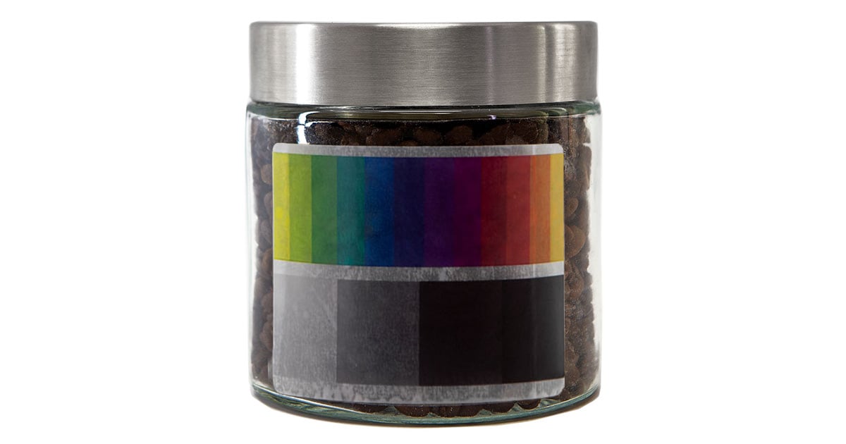
Clear Label Examples: Color Scale
On Glass With White Filling
On Glass With Medium Filling
On Glass With Dark Filling
Clear Label Examples: In-Use
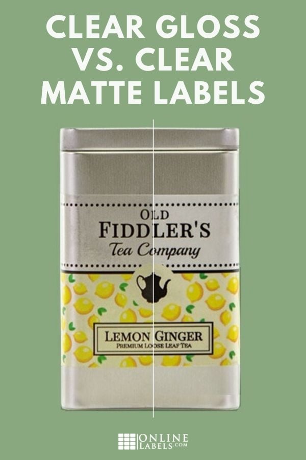
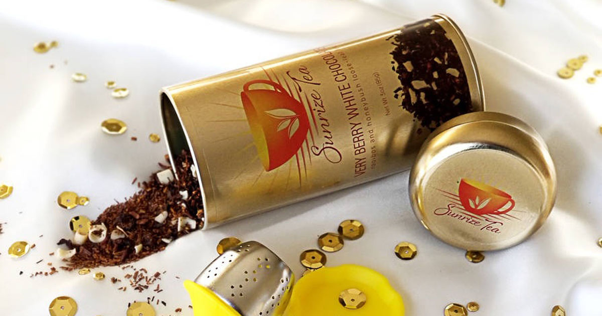
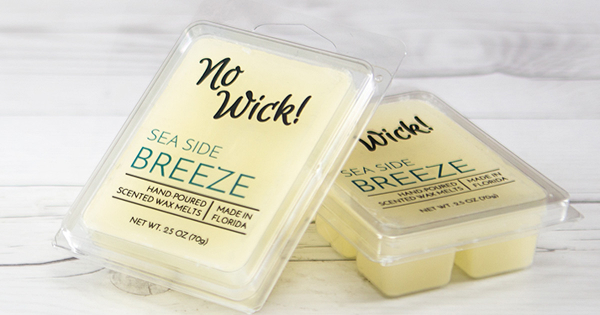
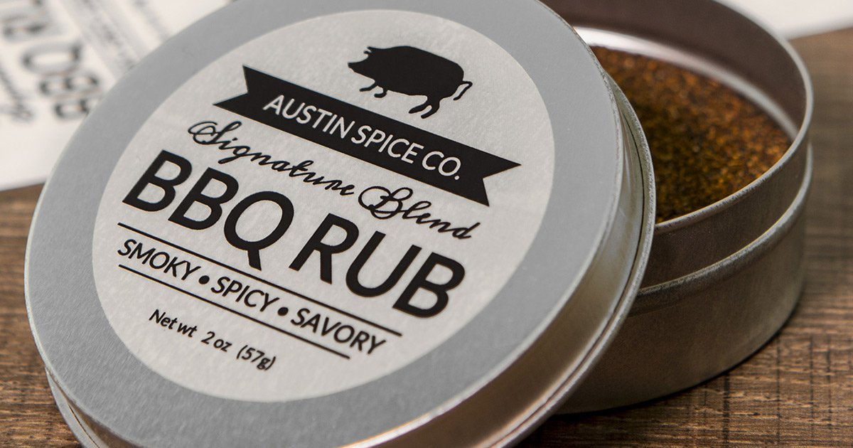
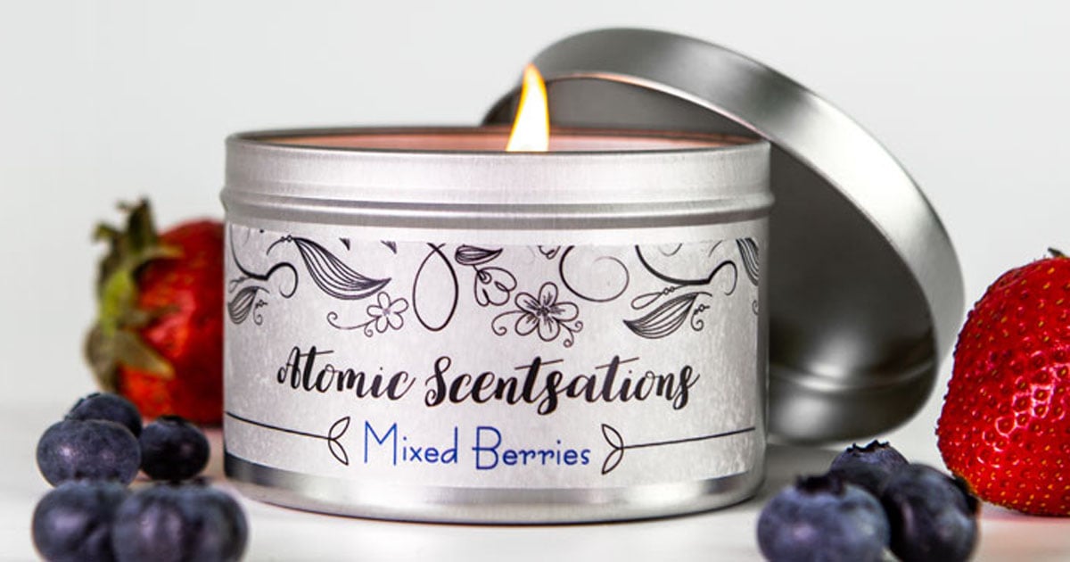
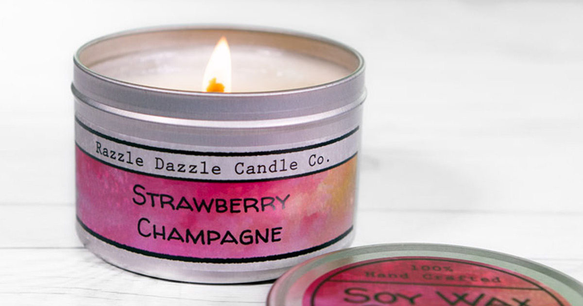
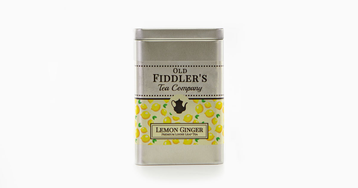
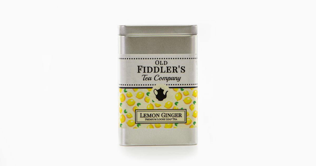
On A Tin Container
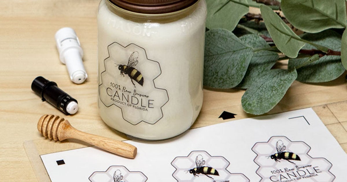
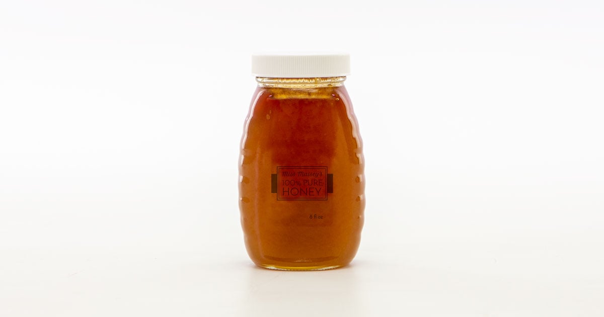
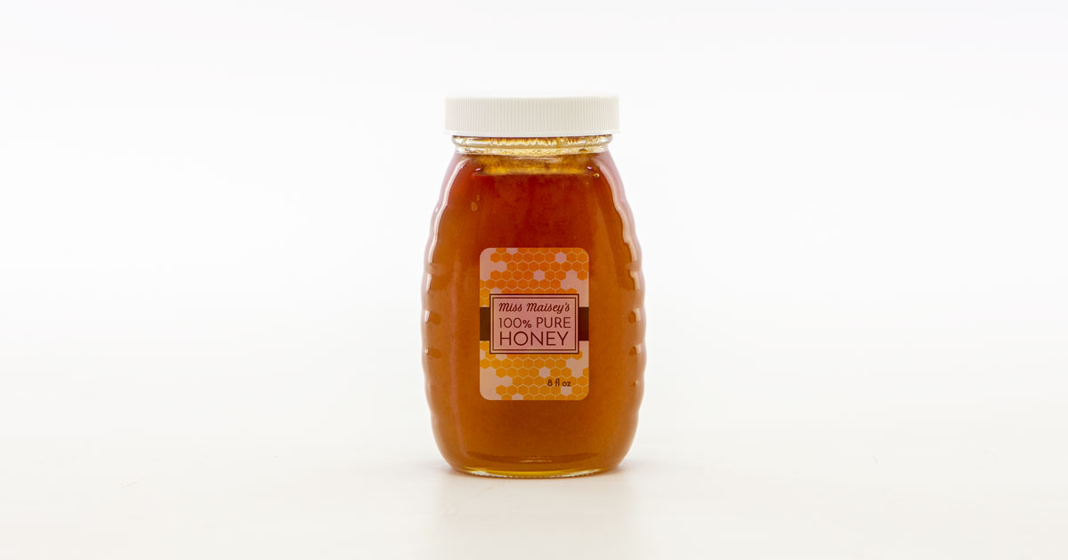
On A Honey Jar
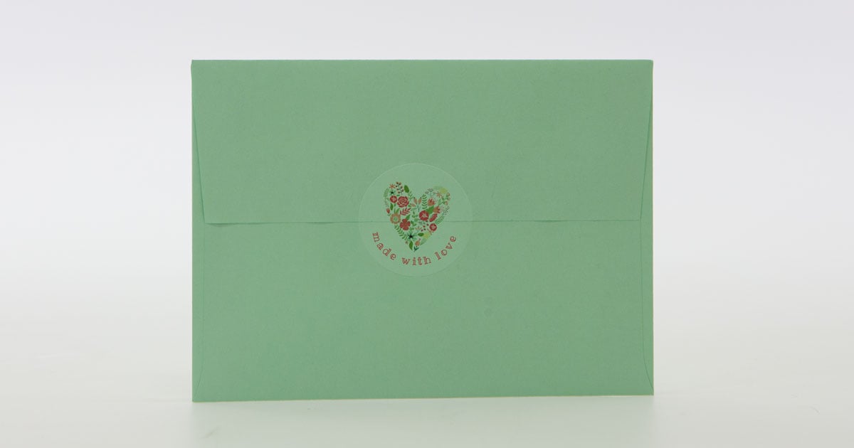
On A Colored Envelope
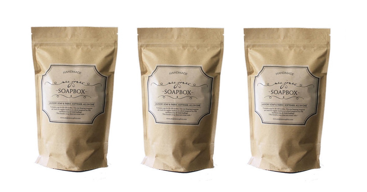
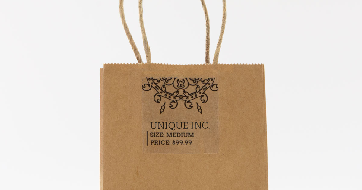
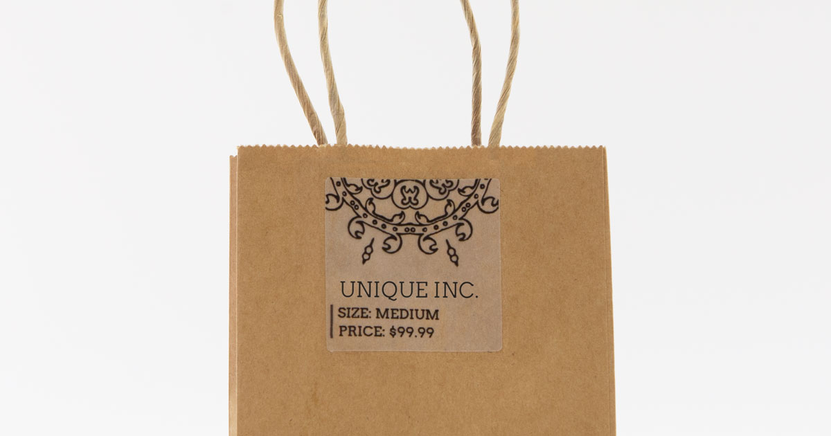
On A Brown Kraft Bag
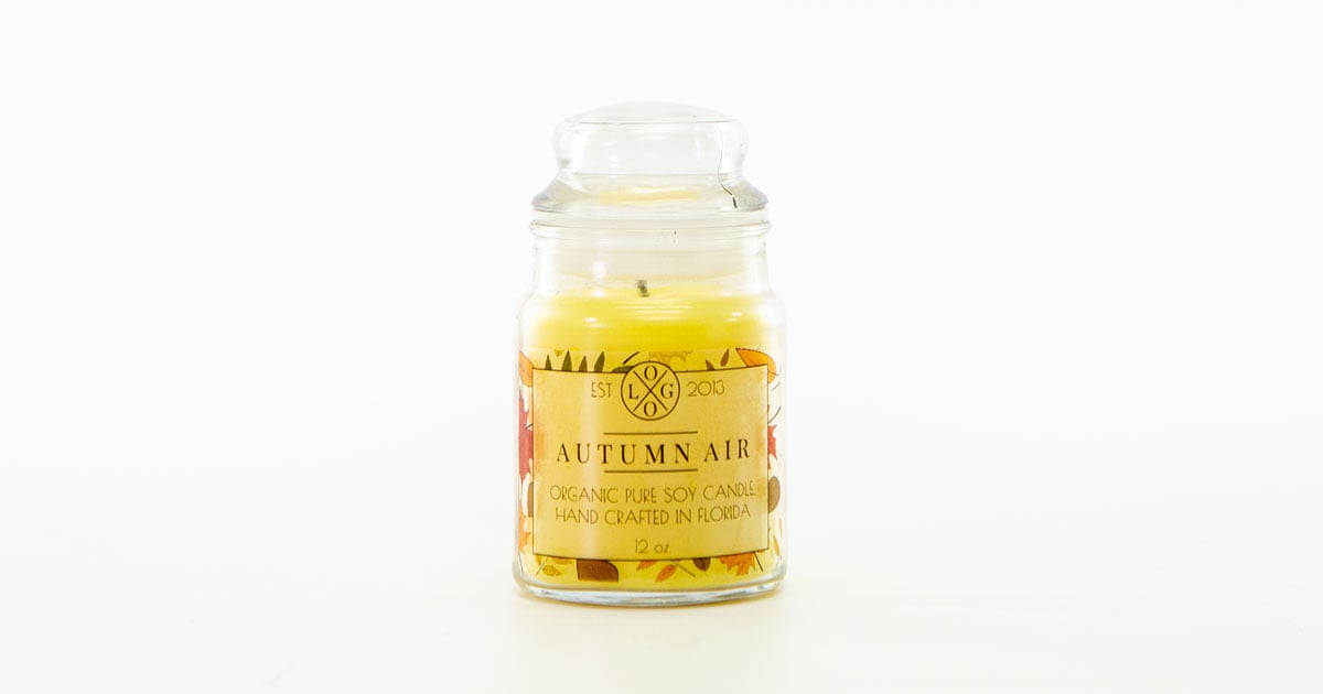
On A Candle Jar
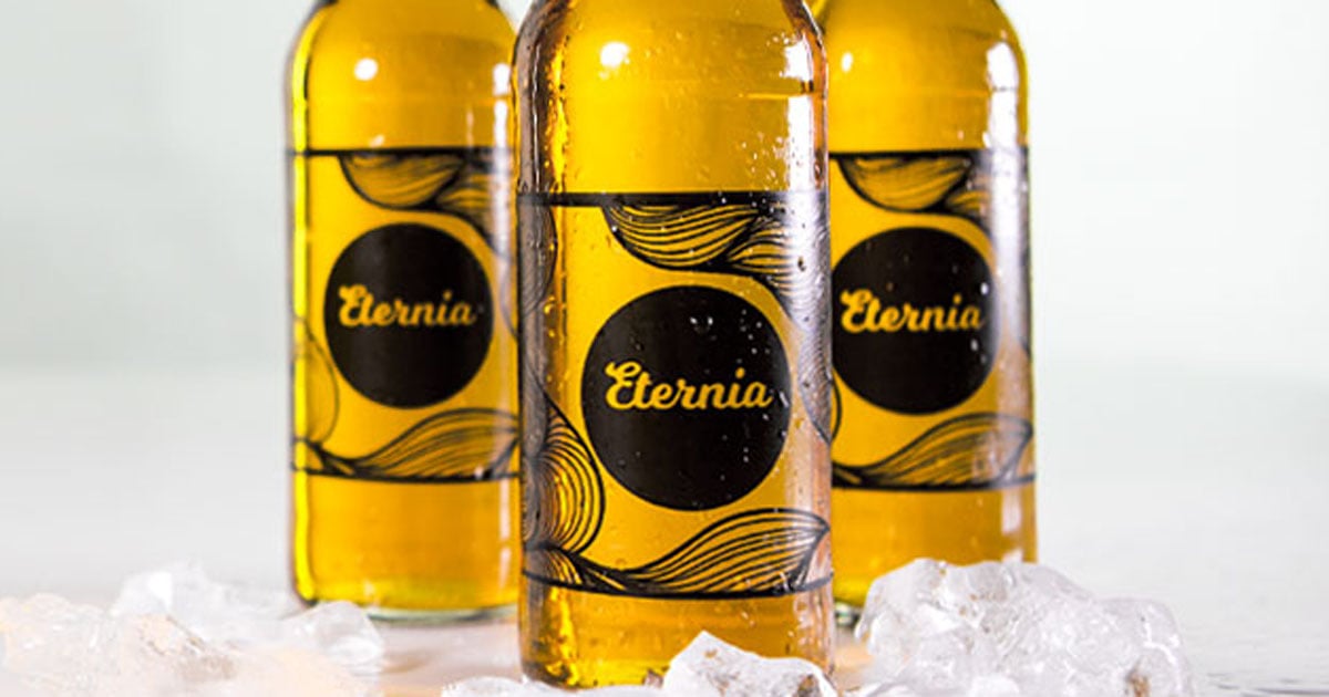
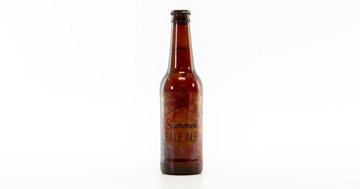
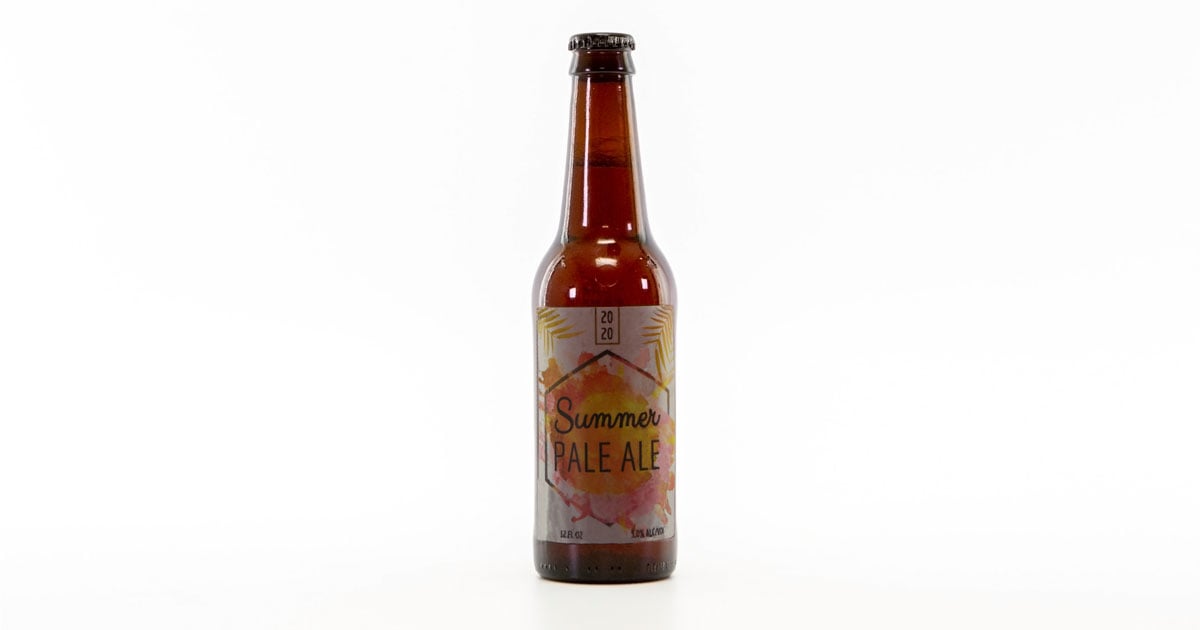
On An Amber Beer Bottle
Not a recommended surface.
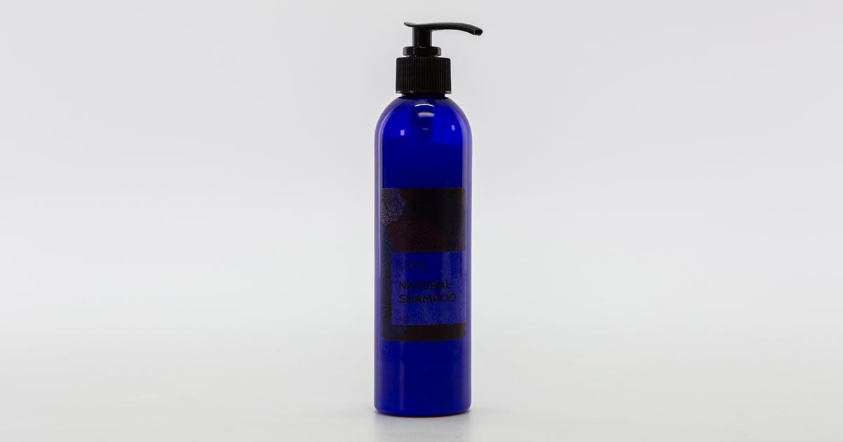
On Colored Plastic
Not a recommended surface.
Clear labels can do wonders for your branding and packaging, but it helps to know what you're ordering! We hope this article gave you insight into our product line.
Shop Clear LabelsOr, shop premium custom clear labels for large quantity orders for your business.
If you still need help deciding on a clear label material, call our customer service team at 1-888-575-2235 or request label samples to compare firsthand.
