12 Cosmetic Label Examples for Design Inspiration
Designing labels for your products is just one step in the process of starting your own cosmetic business, but it’s an important one. With endless design possibilities, it’s difficult to know where to start, and seeing other people’s designs may help to get the creative juices flowing.
Here are a few of our favorite Customer Ideas submissions so you can see how other small beauty businesses have created a cohesive brand and label design.
Not ready to design quite yet? Shop cosmetic labels to explore some popular options for various cosmetic products.
Luxurious Serum Bottle Labels
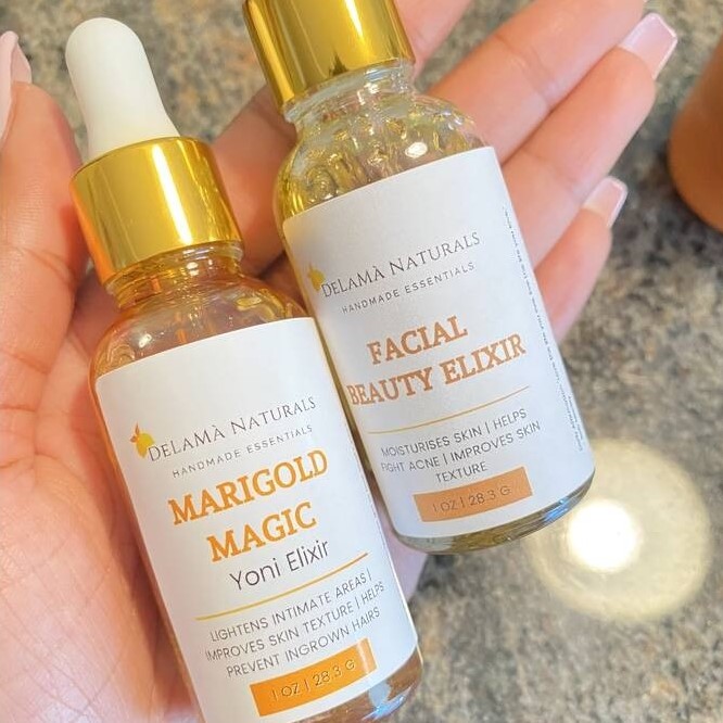
The herb-infused skin and hair products made by DeLaMà Naturals are clean and natural. This specific product, meant for feminine health and beauty, is dressed with a label that conveys a luxurious selfcare feel, between the glossy white texture, and the gold accent bottle.
The labels feature a simple design with a white background, negative space, and orange accents for a monochromatic look. A combination of fonts are used that work well together to create an aesthetically pleasing design.
Products used: OL5051WS, a 1.9" x 2.5" rectangle on White Gloss Laser.
View DeLaMà Naturals’ full submission.
Bright Color-Block Deodorant Label
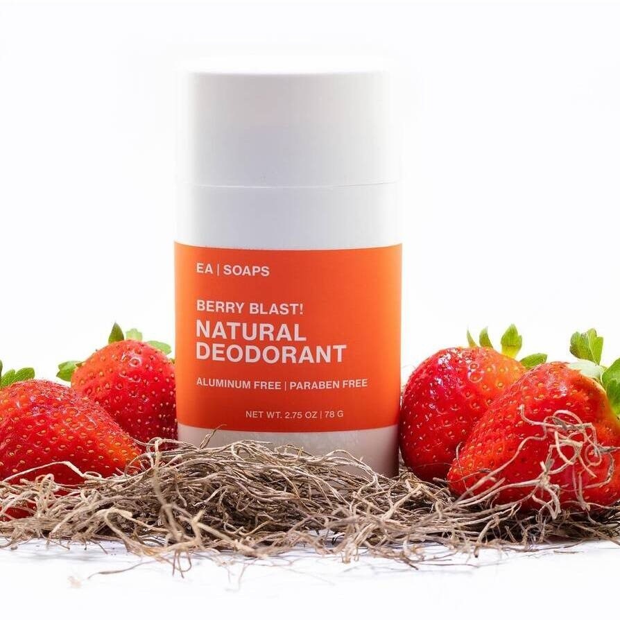
Color is so important, and if you can use it in your cosmetic labeling or packaging to convey something to consumers about your product, then you’re doing it right! EA Soaps does this well with this deodorant.
The berry-red label color let’s consumers know that the product will be, well… berry-scented! This tactic is great if you have a line of products with different scents. Change the color on your label to match each scent for a unified look. The sans-serif font here paired with the white packaging makes for a clean and professional look.
Products used: OL177WJ, a 8.5" x 11" full sheet on Weatherproof Matte Inkjet.
View EA Soaps’ full submission.
Masculine Beard Balm Labels
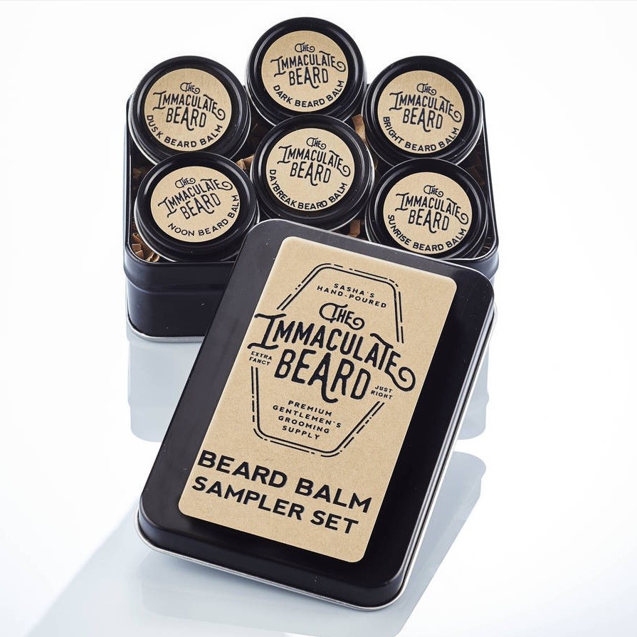
Brown Kraft is always a good label material choice if you’re selling a cosmetic product targeted toward men. With the right design, it gives you a rustic look. It also works to communicate a sustainable product with natural ingredients, which The Immaculate Beard does very well.
The brown kraft against the black containers also creates a luxurious feel, letting consumers know they’re using a quality product at an affordable price. The unique font adds an extra layer of interest to the label and is great for strong branding.
Products used: OL171BK, a 3.75" x 2" rectangle, OL1025BK, a 1" circle, and OL6000BK, a 1.2" circle on Brown Kraft.
View The Immaculate Beard’s full submission.
Dainty Lotion Bar Jar Circle Labels
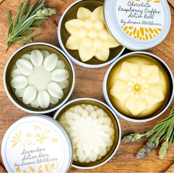
This perfectly dainty design by Lorena Al-Ahmar is creative and matches the aesthetic of the product itself. Like with color, if you can take elements of your product and incorporate it into your design, you have a creative and honest way of catching the consumer’s attention. In this example, the unique flower shape of the lotion bars inspires the floral design on the labels.
The script font used here works well with the floral design and really ties everything together. This packaging style allows you to travel with the lotion bar and always have a nice little container to keep it in, as opposed to most other lotion or soap packaging options where the label will eventually get thrown away with the packaging.
Products used: OL2279WX, a 3" circle on Standard White Matte.
View Lorena Al-Ahmar’s full submission.
Elegant Black and White Wraparound Soap Label
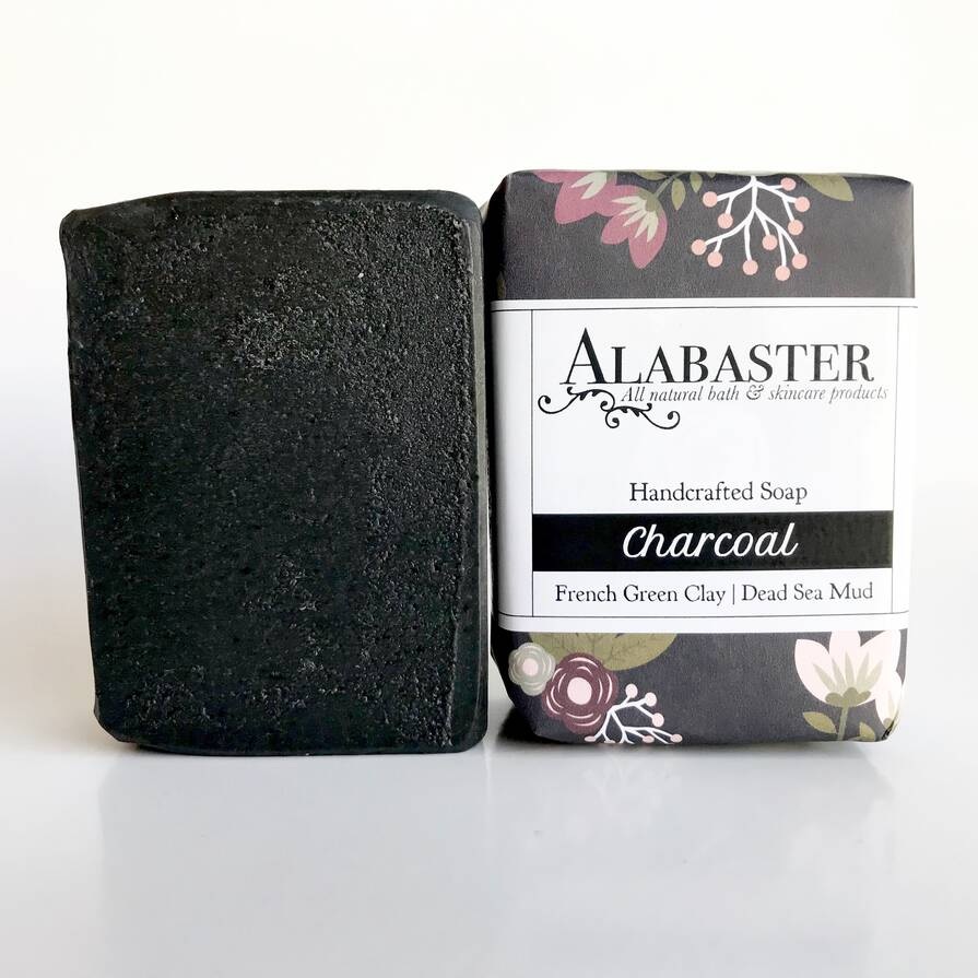
Wraparound labels are a popular option for soap bars, and for good reason. They allow you the flexibility to have your desired design on the front, and put any other necessary information wrapped around on the back or even the sides. This is what Alabaster Soaps does so well with its soaps.
The soap is wrapped with a classy floral paper, and is then wrapped with the white glossy label, which pops against the matte black paper. Both the business name and the main selling point (“Charcoal") are prominent and eye-catching. This is a great soap packaging approach that will leave consumers feeling like they’re unwrapping a special gift.
Products used: OL1159WS, a 8" x 2" rectangle on White Gloss Laser.
View Alabaster Soaps’ full submission.
"No-Label Look" Sugar Scrub Jar Label
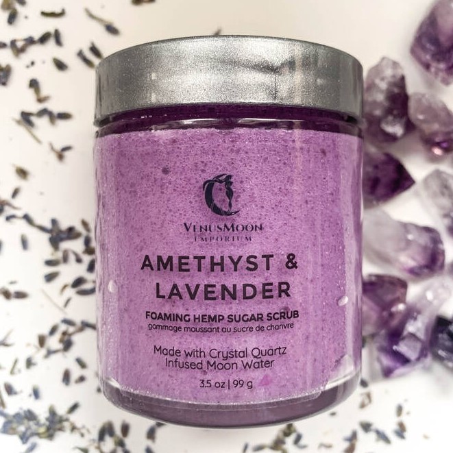
Sometimes, the product advertises itself. Clear labels are perfect for a no-label look when your product is visually important. Venus Moon Emporium does this perfectly with these clear labels — the label is completely invisible, leaving the product as the vibrant backdrop for text.
The label includes the company’s name and logo, scent, brief description and net content, and more while having the color and texture of the product on display.
Products used: OL864CL, a 1.625" x 1.8125" rectangle on Clear Gloss Laser.
View Venus Moon Emporium’s full submission.
Natural Honeycomb Lip Balm Labels

These lip balm labels by Gaiser Bee Co. are so cute and well-themed. Their lip balm is 100% natural and made using beeswax, and this is showcased on their labels with the honeycomb pattern and bee graphic. If your product being natural or even organic is important to your brand, brown kraft material is a good option to fit that style.
An easy way to use a background print on your labels, like the honeycomb pattern seen here, is to use another shape like an oval or rectangle over the pattern where you can neatly keep product and company information.
Products used: OL1102BK, a 2.125" x 2.125" tamper evident tab lip balm label on Brown Kraft.
View Gaiser Bee Co.’s full submission.
Pop-of-Color Body Balm Labels
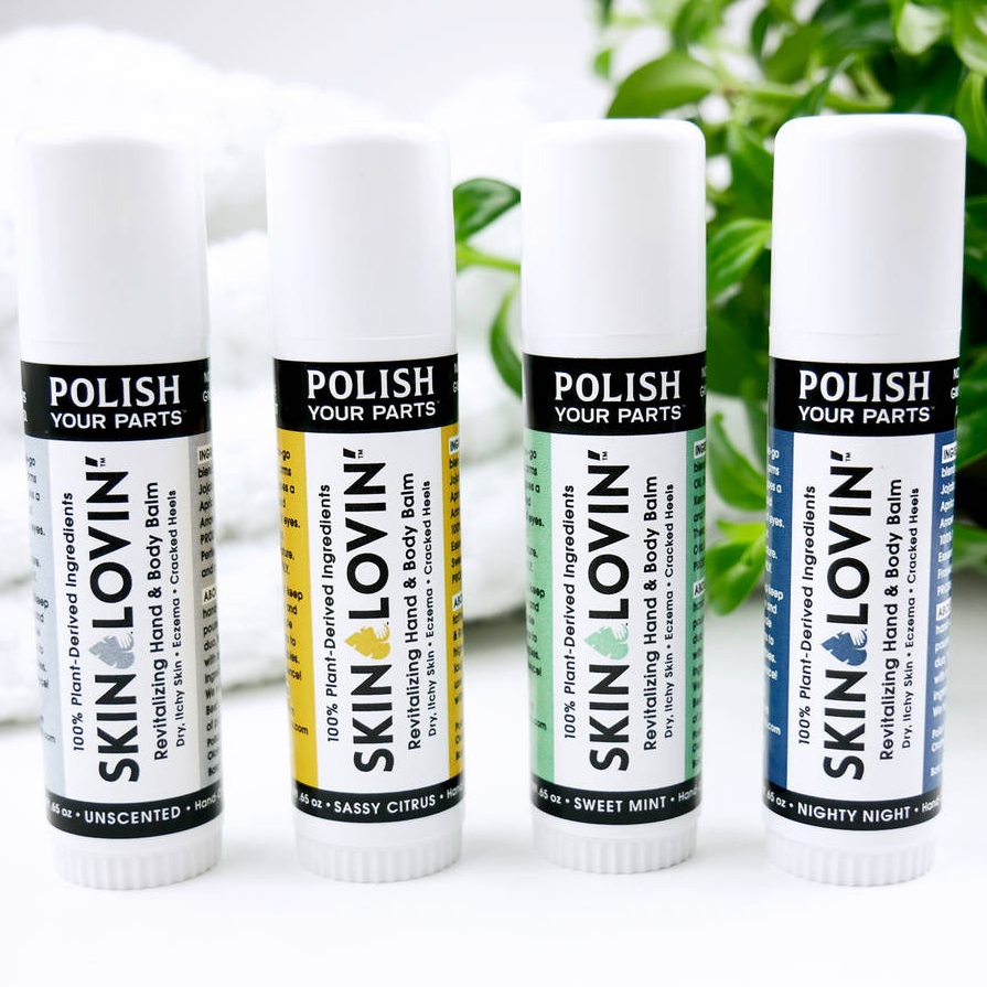
When working with a product container that is smaller, and especially if it’s cylindrical, use it to your advantage by playing around with a combination of horizontal and vertical text. You see it done well on these body balm labels by Polish Your Parts. Doing this creates visual interest while allowing you to fit all the necessary information on the label.
For a company called Polish Your Parts, they sure know how to create a polished design. This is achieved by the use of negative space, different color accents for different scents, and different text sizes for a hierarchy of importance.
Products used: OL5030LP, a 3.375" x 2.3125" rectangle on Weatherproof Polyester Laser.
View Polish Your Parts’ full submission.
Bold and Rustic Shea Butter Jar Circle Labels
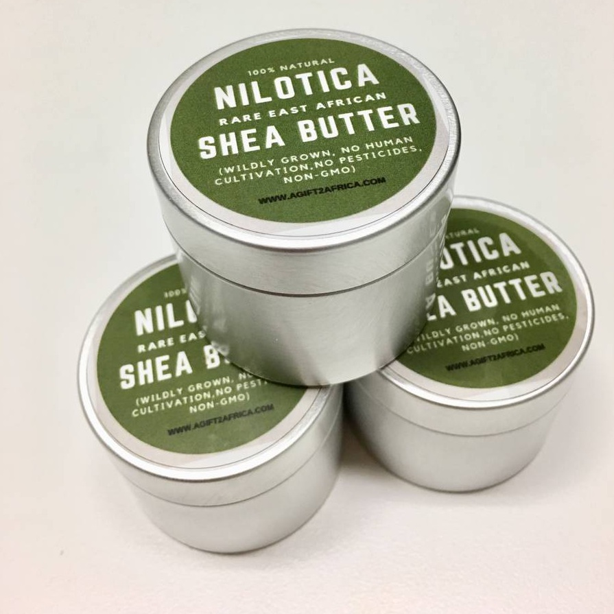
Rarely do you see an army green label, especially on cosmetics, but A Gift To Africa really makes it work on these shea butter jars. Playing around with unique and bold colors can help your product stand out from the rest, as long as it fits your brand and voice.
Brown kraft isn’t the only way to achieve a natural look on your labels — this rustic green color communicates the point as well. Brown kraft isn’t a weatherproof material, so picking another earth tone color to use as the background for your labels opens up the possibility of having a weatherproof label, while still maintaining a natural look.
Products used: OL325WS, a 1.67" circle on White Gloss Laser.
View A Gift To Africa’s full submission.
Delicate Bath Soak Label
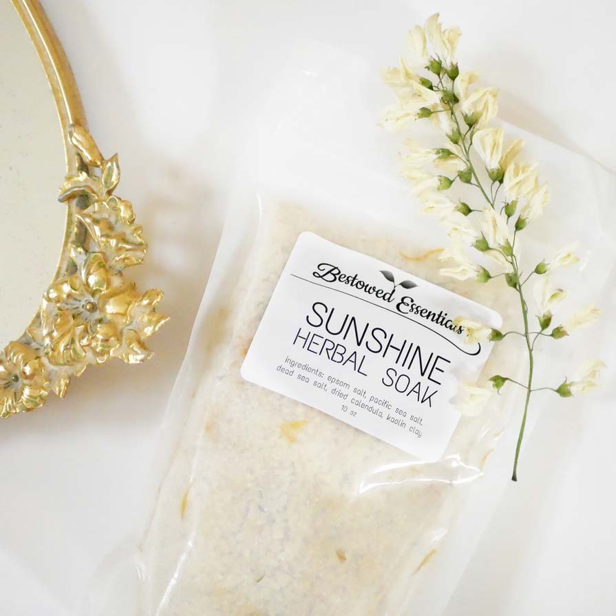
Sometimes, less is more. This simple bath soak label by Bestowed Essentials perfectly displays important information without overwhelming consumers with too many details.
It’s also tricky figuring out the best label option for plastic bags since they’re so pliable. If you run into that issue, we say the smaller the better. In this example, we see a small rectangle label that includes the business name/logo, product name, and ingredient list which in itself advertises the natural quality of the product.
Products used: OL775WX, a 2.675" x 2" rectangle on Standard White Matte.
View Bestowed Essential’s full submission.
Soft Pink Body Scrub Label
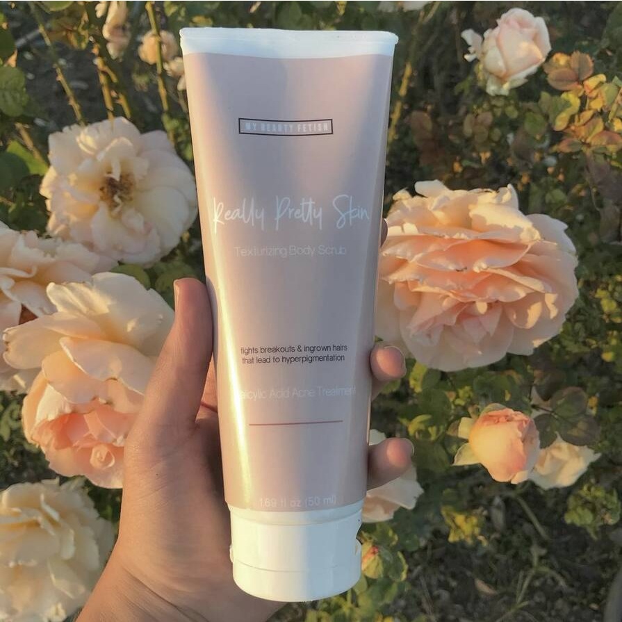
Pink is usually a reliable color to use when you’re going for a feminine brand, like this beautiful light blush pink on My Beauty Fetish’s body scrub labels. The use of negative space creates a visual hierarchy and the end result is a professional-looking label.
The dainty script font front and center on this label helps to drive home the point that this product is for feminine beauty, and is the perfect way to end a day of self-care. The black text toward the bottom also helps the main selling point to stand out the most.
Products used: OL177WI, a 8.5" x 11" full sheet on Weatherproof Gloss Inkjet.
View My Beauty Fetish’s full submission.
Natural Belt Buckle Soap Bar Label
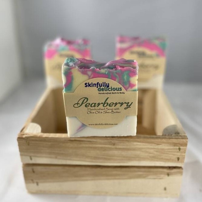
Buckles are another popular option for bar soap labels, allowing you to add product details to the shape in the middle, and wrapping the arms around. The unique shape can be intimidating when designing, but these labels by Skinfully Delicious show how creative you can get with it.
The design features just enough necessary information about the product for the consumer, and plays around with different fonts and colors to create visual interest.
Products used: OL1103TC, a 8.5" x 2.375" buckle on Light Tan.
View Skinfully Delicious’ full submission.
We hope that after seeing these 12 cosmetic label designs, you’re feeling inspired and ready to get started on your own unique product labels. Shop our selection of cosmetic labels today to see why we're the trusted supplier for businesses everywhere. To see more customer label submissions, check out our Cosmetic Customer Ideas Gallery.


