Discover 5 Innovative Ways Round Labels Can Help Your Branding
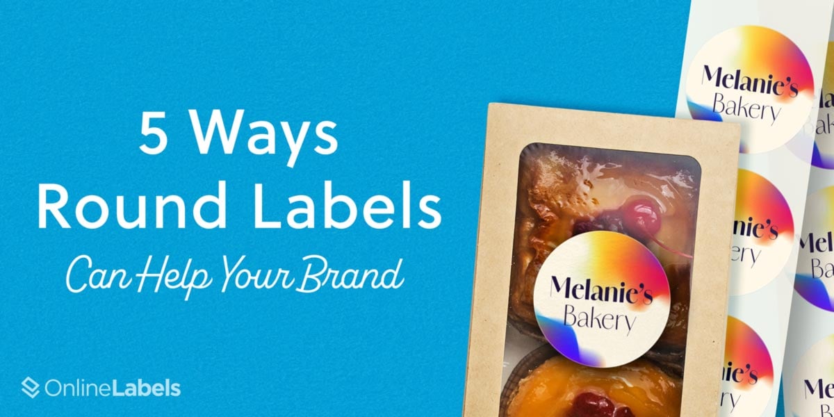
Did you know the shape of a label holds significant influence over how consumers perceive a brand? Shapes are intrinsic tools in marketing that transmit emotions and elevate aesthetic appeal. Among the array of shapes available, one with a particular advantage is the round label design.
How Round Labels Enhance Your Brand Look
Round labels offer a subtle yet powerful way to elevate a business’ brand presence. Their simple shape naturally draws the eye, providing an aesthetically pleasant platform for a company’s logo or message. When strategically placed on products, packaging, or promotional materials, these labels can significantly enhance brand recognition.
Some examples of industries that commonly use round labels are:
- Food and Beverage: they give products a homemade, yet professional look that draws customers toward the product. They can be used to highlight ingredients or certifications, too.
- Cosmetics and Skincare: they're perfect to showcase a logo in lip balms or essential oil bottles and are used to highlight key benefits such as “Vegan” or “Cruelty-free.”
- Health and Wellness: they provide a sense of trustworthiness and approachability, and are perfect for bottles of vitamins, protein powder, or any wellness goods.
By utilizing round labels, businesses can create a cohesive and memorable brand experience that resonates with their target audience. Here are five compelling ways in which round labels can improve brand identity and leave a lasting impression on your audience.
1. Understanding the Importance of the Shape
Shapes build sensory responses that can generate a pleasant response from audiences and distinction from other brands. In particular, round labels generate a more friendly reaction from consumers because their distinctive form breaks away from the conventional angular or square shapes. This attracts more attention and makes products more memorable.
The Federal University of Lavras and the University of Sao Paulo (USP) conducted an experiment on this topic by investigating the importance of shape through coffee labels. The main hypothesis was how label designs are a crucial agent in creating positive sensory responses. They invited 174 participants who encountered two types of labels—circular and angular—on coffee containers, with all cups containing the same brew. The results showed that label shape significantly influenced participants' expectations before tasting. Notably, most people preferred coffees with round labels because roundness tended to be associated more with sweetness, while angular labels tended to be associated more with sourness.
Round labels are more than just a part of branding, they produce amiable sensory responses that can cause brand recognition and recall with clients. The shape of these tags provides a sense of familiarity that creates positive hedonic and sensory responses.
2. Enhanced Aesthetic Appeal
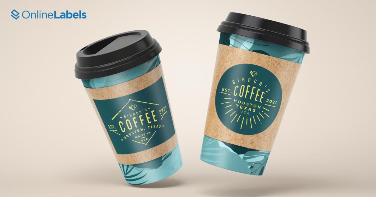
Round labels can improve the overall aesthetic appeal of products. Whether it’s a minimalist design or an intricate pattern, round labels can complement a product’s aesthetics and elevate its style.
One example is Tide. Throughout the decades, Tide has kept the original concept of the architect-artist Donald Deskey by keeping its original colors: cadmium yellow, orange-red, and cobalt blue. However, in contrast with the first logo used from 1946, which had a rectangular shape, the current circular one has been more used since 2014.
The current success of this label is due to its shape. Round labels can provide a striking design which helps colors like yellow, and orange work as complementary colors for the blue font, providing the perspective that it's popping from the screen. This makes the elements of the design appear more centered and generates a better aesthetic appeal that helps the logo stand out more.
3. Colors are Perceived Better
Colors play a pivotal role in logo design, possessing the power to evoke emotions and forge associations with a specific brand. Round labels can enhance how customers perceive colors when they look at branding. Their round shape helps with aspects of memory and familiarity, making logos more appealing and memorable to an audience.
This is further explained in an experiment based on Memory Color Effect which measured memory color effects of logos and their familiarity. The study consisted of participants adjusting the color of a gray block containing a logo to look like its original color. Then, they presented the candidates with gray logos with high familiarity in the market, middle familiarity, and low familiarity. In the end, the participants were able to recognize the colors and the brands of the products due to their familiarity with the shape and how it was perceived.
In other words, people identified better with common colors such as red, and common shapes like rectangles or circles.
When it comes to coloring, round labels offer a sense of familiarity that triggers audiences to trust the product and its content. Furthermore, it offers a great platform to showcase vibrant and eye-catching hues that capture the essence of your brand and make them memorable.
4. Adaptability to Smartphone Apps
For more than a decade, smartphones have revolutionized the way brands format their logos. Recently, companies have had to adapt their logos to be formatted correctly for apps and social media profile pictures. One famous example is the evolution of the Pinterest logo. In 2010, the company introduced its first design which was a hand-written logo with a combination of black and blue letters. When their iPhone app launched in 2011, Pinterest wanted to have a more easily recognizable logo that stood out on mobile phones. They changed their logo to a red circle with a white, Grotesk Sans Serif P in the middle.
The shape made the logo appear more polished, and it adapted easier to smartphone apps and social media. In this way, companies like Pinterest can showcase their identities more effectively and have a better visual appeal while users are scrolling through their phones.

5. Round Labels Have a Greater Consistency with Margins
Round labels offer several advantages when it comes to margins. Because of their uniform shape, they can easily maintain consistency around the entire label compared to rectangular and angular shapes. This consistency can contribute to a more polished and professional appearance.
A great example of this is the Sixpence Stout Christmas beer campaign design of 2023, where the company introduced a black design with a white cover and a stunning white, round logo. The reason why round labels helped the campaign with margins is because it provides adequate space between the label edges and the curved surface of the bottle, ensuring that important information is visible.
Round labels also help margins look cleaner and more polished in contrast with other forms. They are also very flexible when it comes to the printing process and help to keep familiarity with and size with other products of the Sixpence Stout’s franchise.
Round Labels, Unmatched Benefits
Choosing the right shape for a logo or label design can provide a 180 degree change to your business. Round labels have a variety of elements that make them unique and stand out to customers. Their shape provides a sense of familiarity that can attract customers and enhance your brand. Also, their unique shape provides the correct aesthetics for color as well as easier use of margins and font. With their versatile design and eye-catching appeal, round labels are the perfect way to add a touch of creativity and organization to any project!
OnlineLabels Has Your Round Label Solution
We offer blank and custom round labels on sheets and rolls as well as custom round stickers. Check out our collection of round labels and stickers, with sizes from 0" to 8" today.


