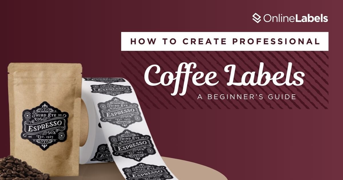
How to Create Professional Coffee Labels: A Beginner’s Guide


With 43,165 coffee manufacturers worldwide, how do you make yours stand out? Well, you start with the coffee label!
Coffee labels can make a significant difference when deciding which product to purchase. From the logo and its typography to colors and materials, every detail helps portray your brand's essence. A perfectly designed coffee label can capture attention and turn a casual sale into a loyal customer.
In this article, we'll discuss each part of the label in depth and how to design a coffee label that will make your products disappear from the shelves and end up in your customers' pantries.
Jump to a Specific Section
- Define Your Coffee Brand Identity
- The 11 Essential Elements of a Coffee Label
- Common Coffee Label Design Pitfalls
- What Makes a Coffee Label Visually Appealing to Customers?
- How to Design and Print Coffee Labels with Maestro Label Designer
- Are You Ready to Start Designing Your Coffee Labels?
Define Your Coffee Brand Identity
Think about what makes your coffee unique. Are you offering small batches or artisanal coffee with hand-picked beans? Do you focus on convenience and affordability or opt for elegant, sophisticated ingredients?
To design a coffee label that portrays the qualities of your brand but also follows design guidelines, you must understand the format most coffee labels follow. This consists of eleven main elements:
The 11 Essential Elements of a Coffee Label
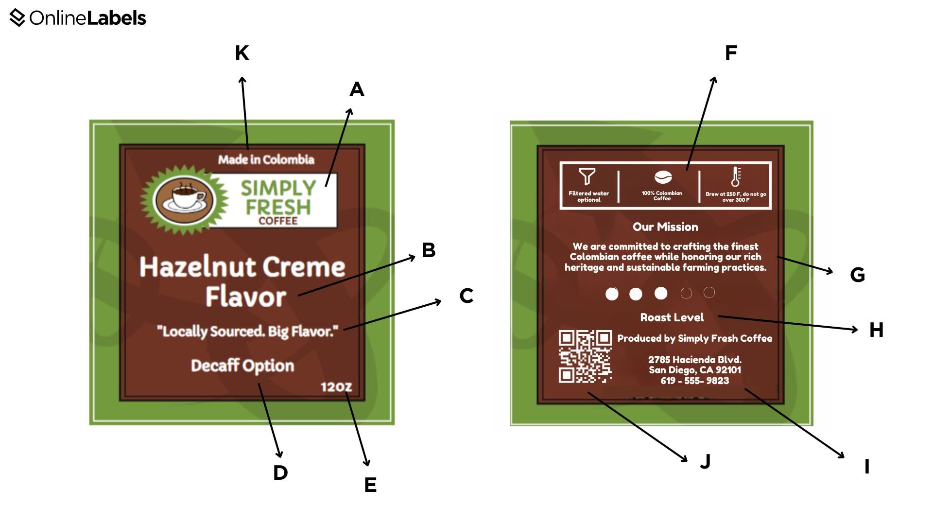
- A. Coffee brand: features the primary logo and brand name to help customers recognize the company.
- B. Coffee flavor: describes the primary taste characteristics of a product.
- C. Packaging phrase: although this option is optional, many coffee manufacturers, like Starbucks, use it to highlight the product's culture or results.
- D. Measurement of caffeine content: it shows the level of caffeine, which can range from decaf to espresso.
- E. Net weight: the weight of the coffee bag's content, which can come in grams or ounces.
- F. Brewing recommendations: shows how to use the product and different temperature and usage insights.
- G. Mission statement: this is also optional and helps connect with your audience and help them understand your brand.
- H. Roast level: indicates whether the blend is a light, medium, or dark roast.
- I. Company information: displays the address and phone number of the coffee brand.
- J. QR code: this optional code can include the company's website or social media channels so the client can research more about your company.
- K. Origin information: this part includes the country or region where the beans were produced. Some specialty brands highlight the specific farm where they were harvested.
Common Coffee Label Design Pitfalls
Now that you understand the key elements of a coffee label let's explore some common design mistakes to avoid. What makes a coffee label truly appealing? It all comes down to two essential elements: visual aesthetics and branding.
While these may seem straightforward, many overlook them during design, leading to cluttered labels or failing to make the logo the focal point. It's essential to balance eye-catching design and clear branding to create a stand-out label.
This is an example of what we're trying to avoid.
- Although the title and logo are visible, the overall design feels cluttered, drawing away from the label's primary focus.
- Using more than three fonts creates a visually overwhelming effect, making it harder for the viewer to process information.
- The label contains excessive text that could be arranged more efficiently so the viewer can quickly pay attention to each piece of content.
How to Organize Your Coffee Label Layout
Designing coffee labels is more than just providing information; it's about choosing the right colors and fonts and strategically placing them on the label.
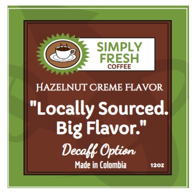
Here's the same label as above, but this time, we arranged it in a way that looks more organized and more straightforward to read:
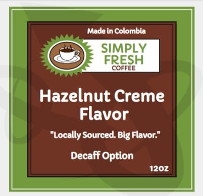
- This label presents the flavor as the primary focus without disrupting the main logo.
- All text elements use the same font style, creating a cohesive look that enhances readability and maintains visual order.
- From the flavor note to the slogan, every detail is thoughtfully balanced, ensuring the viewer can quickly grasp the product's quality.
What Makes a Coffee Label Visually Appealing to Customers?
The correct use of typography, strategic design, material choices, and color selections make a coffee label successful. Let's take an in-depth look at each concept.
The Psychology of Coffee Label Design
The average consumer takes 3-5 seconds to choose a product, and they constantly focus on three main factors: the brand's personality, differentiation from competitors, and emotional connection to the product's flavor and/or experience.
To build a strong coffee label based on these three factors and resonate with consumers on a psychological level, we must consider three essential elements:
A. Proper Font Selection for Your Coffee Label
The key is to create a hierarchy of information using a few fonts. Here's a list of standard fonts used by coffee brands:
- Serif fonts (Garamond, Baskerville, Playfair Display) help create a sense of tradition, craftsmanship, and heritage. Often used by specialty or artisanal coffee brands, serif fonts can help develop an understanding and provide a sense of timeless quality.
- Sans-serif fonts (Montserrat, Futura, Open Sans) are clean, modern, and highly readable, giving your coffee label a contemporary look.
- Handwritten or script fonts (Amatic SC) add a touch of elegance and personality, creating a handcrafted feel as if the label were written by hand.
Always use a consistent font throughout your coffee label to maintain a cohesive look. Place the logo in the center or upper portion of the design to ensure it remains the focal point. For a deeper analysis of font selection and how different typefaces impact product packaging, check out our fonts guide for expert insights.
B. What Colors Work Best for Coffee Labels?
Color is a fundamental part of a product. Successful coffee brands have color consistency across their product line and make color choices to transmit different colors or associations; here's a list of the most common colors used in coffee labels:
- Brown tones and neutrals help to evoke warmth and can align with darker packages.
- Deep blacks and rich gold are often used for high-end brands to show an elegant design.
- Bright reds and oranges are associated with warmth and symbolize fun and bold flavors.
- Blues and greens emphasize freshness and elegant designs. These colors can help add a refined touch to the design.
C. What Label Materials Are Good for Coffee Labels?
Choosing a material for coffee labels is crucial for protecting the information from external factors. The best materials for coffee packaging provide a substantial barrier against moisture, water, and other factors that can all impact the quality of the product's content.
Here are some materials that are ideal for your coffee labels:
Weatherproof vs. Paper Materials For Coffee Labels
It is important to consider durability and how the packaging will be stored. Most label materials can be broken down into two categories: weatherproof and paper. Each comes with key factors to keep in mind:
- Weatherproof labels are designed to withstand moisture and humidity, making them ideal for temperature changes and harsh environments.
- Paper labels might not resist external conditions, but they provide a handcrafted, organic feel and are ideal for small-batch roasters.
- Permanent labels are designed to adhere securely to packaging and resist peeling, making them ideal for most coffee packaging scenarios.
- Removable labels use a lighter adhesive, allowing them to be peeled off without leaving any residue in the package. This helps with temporary branding, promotions, and reusable packaging.
Permanent vs. Removable Materials for Coffee Labels
When choosing labels for coffee packaging, consider the longevity and strength you want the label to have in the product. Permanent and removable labels have distinct advantages depending on how the labels will be used and how the coffee bags will be handled.
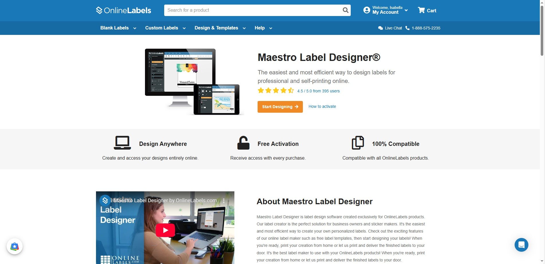
How to Design and Print Coffee Labels with Maestro Label Designer
Printing your coffee labels can be a challenging task, but here are some helpful tips for printing coffee labels using Maestro Label Designer:
1. Launch Maestro Label Designer in Your Desktop
Launch Maestro Label Designer and sign in or create an account.
2. Start Creating a New Design
Click the Design New Label button on the upper left corner of the screen to open a new design.
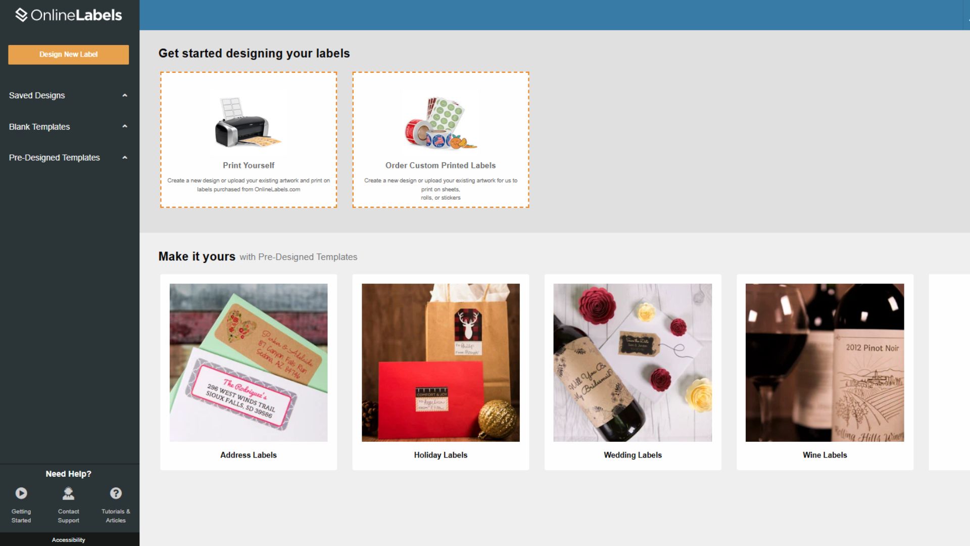
You can start a design from scratch using blank templates or a pre-designed template. For this example, we'll start with a Pre-Designed Template.
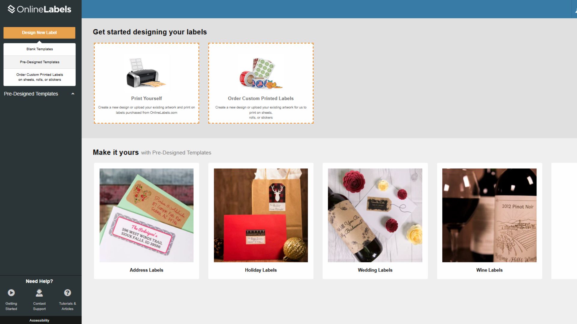
3. Open the Coffee Labels Designs
Our pre-designed templates offer a wide range of designs for your coffee labels. Use the search bar at the top to browse for coffee labels.
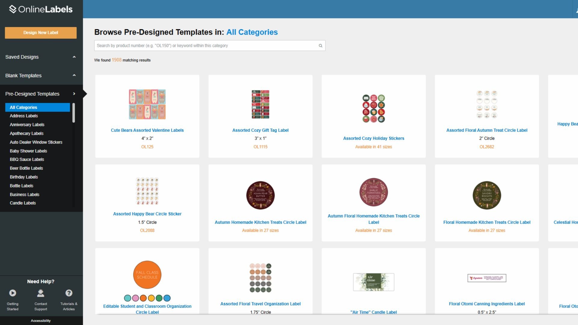

4. Choose a template and start designing
Select one of the templates and start editing to your liking. Maestro Label Designer offers a variety of design tools, from letter types to design elements.
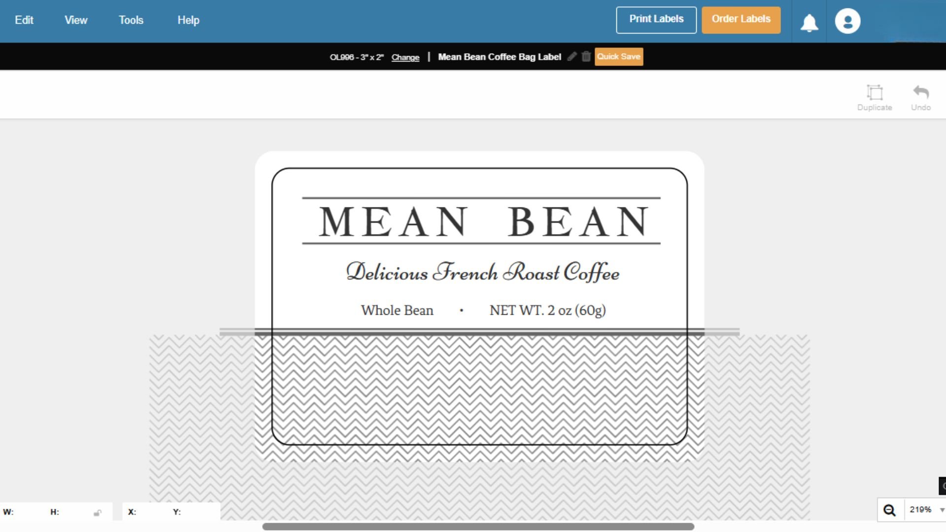
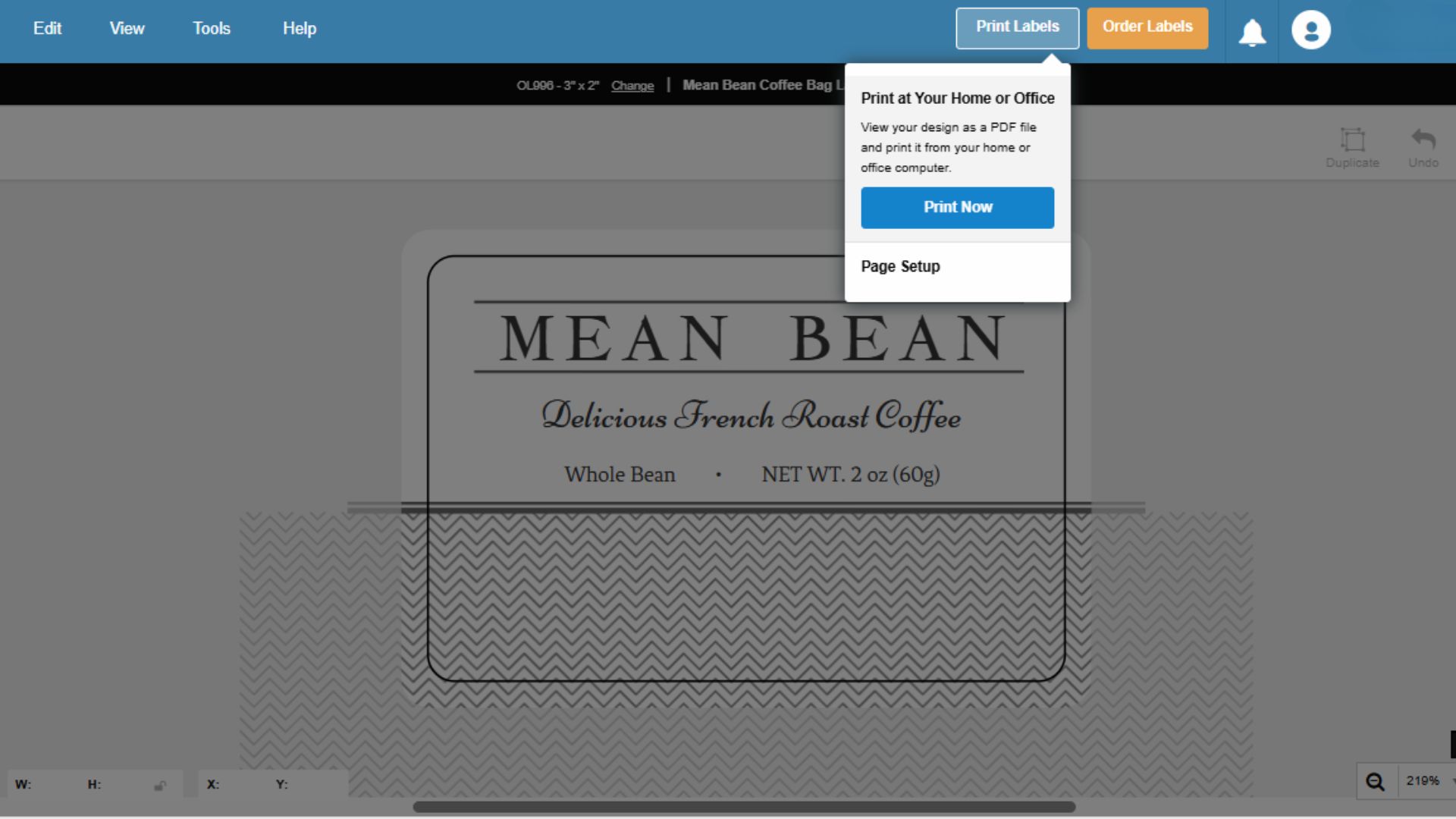
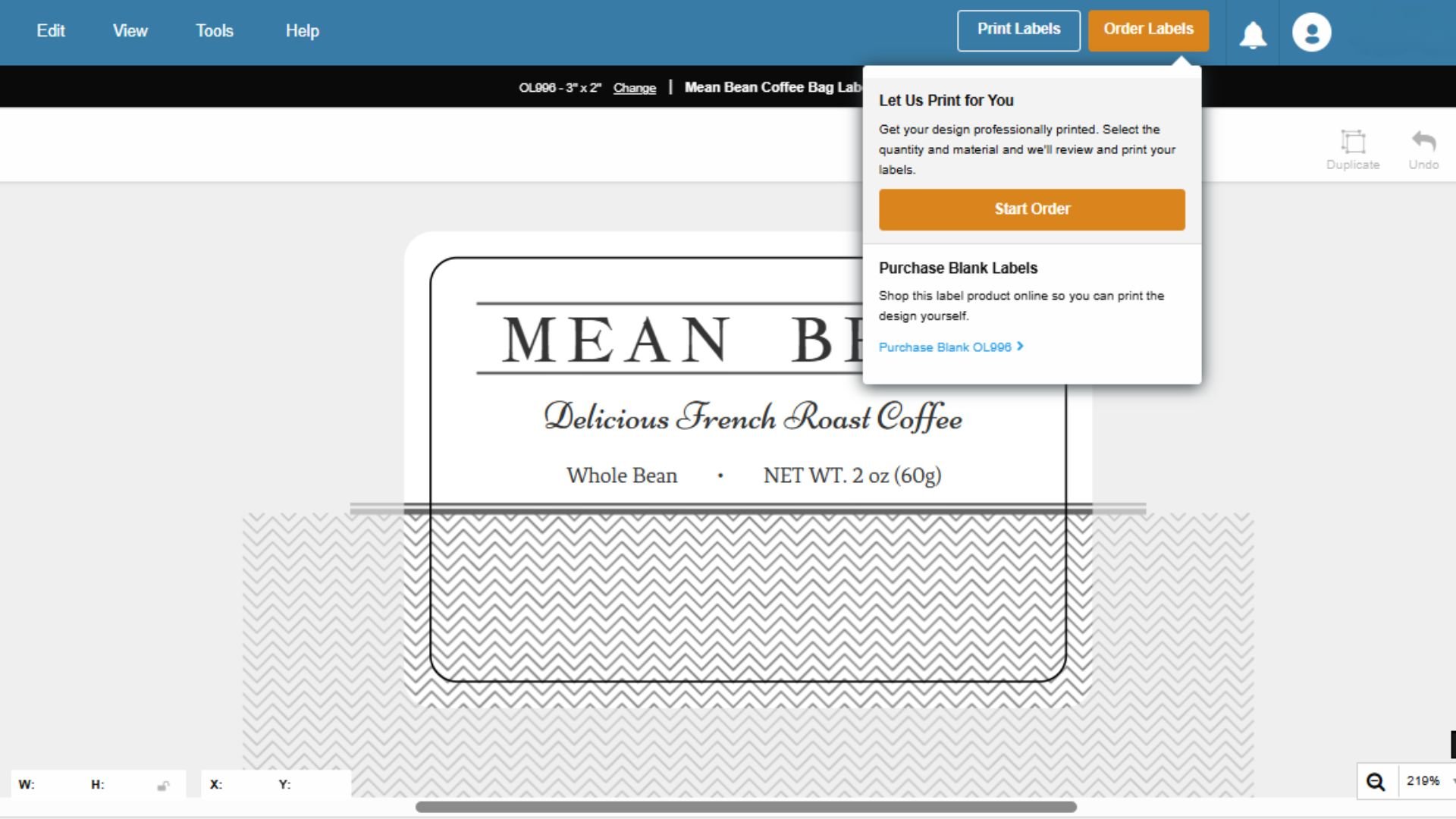
5. Print Your Labels or Order Custom Labels
Once your design is ready, you can print your labels or order them custom-printed by us on the upper right corner of your screen. You can download and print your labels by choosing the print label option.
The Order Labels option will allow you to select the material and quantity of your label.
Are You Ready to Start Designing Your Coffee Labels?
Designing the perfect coffee label ensures every detail reflects your brand's identity and makes customers want to repurchase the product. From choosing the right fonts and colors to selecting the right materials and organizing your elements effectively, each step plays a vital role in making your coffee stand out. By following these design guidelines and using tools like Maestro Label Designer, you can create labels that attract attention and build lasting connections with your customers. So, are you ready to start crafting labels that will elevate your coffee brand and leave a lasting impression?