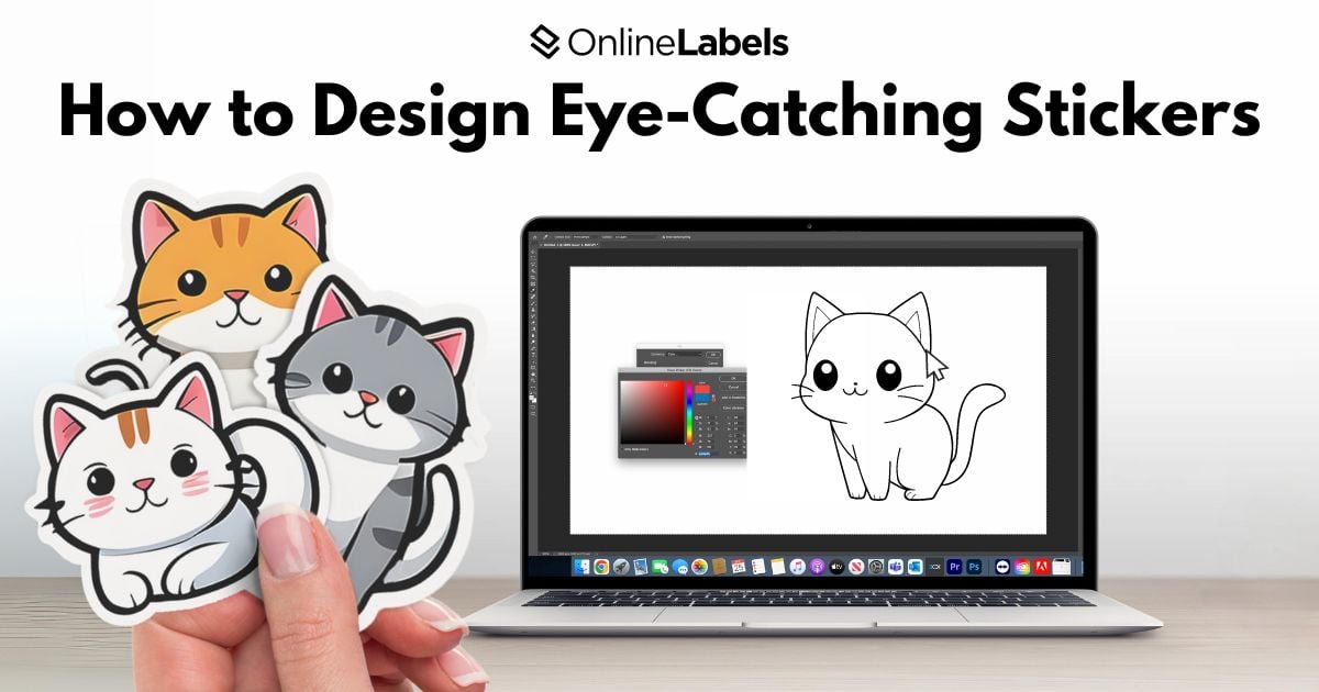
How to Design Eye-Catching Stickers


Stickers can have a substantial impact on businesses!
Whether you're using them for branding, packaging, or personal designs, well-designed stickers can capture attention and leave a lasting impression! This article will teach you the essentials of a good sticker design, including the most popular fonts for stickers, color, and dimension analysis. These will draw the audience's eye and help the sticker make a lasting impression when stuck to water bottles, laptops, or other surfaces.
What is the Design Structure of a Sticker?
Designing an eye-catching sticker starts with understanding its basic structure. Every sticker has several key elements that work together to create a visually appealing design. By understanding these elements, you can ensure that your sticker looks appealing to the eye and effectively communicates a message.
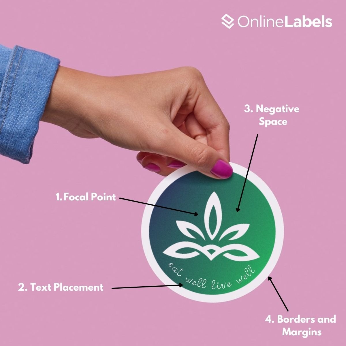
Here’s a breakdown of the main components:
- The Focal Point: this is the center of the sticker design; it's the element that grabs the most attention. This could be a bold graphic, a brand logo, or an impactful word or phrase. This can be accomplished with solid visuals, contrasting colors, or visually appealing text. Your design may appear more straightforward and easy to understand with a clear focal point.
- Text Placement: text is often an essential part of the sticker design, especially when including a website or product information. The key is to keep the text minimal and not overwhelm the visual elements.
- Negative Space: don’t be afraid to leave some areas of your design blank. Negative space keeps the design from feeling crowded and allows the focal point to breathe. It directs the viewer’s eye toward the essential elements of the sticker.
- Borders and Margins: including borders or margins around your sticker can create a frame that enhances the design's visual impact. This simple addition can make your design look more polished and ensure the essential elements are kept in the system.
How to Choose the Right Colors
Finding the right colors for your stickers is essential to finding a visually appealing balance and making them attention-grabbing. Start by thinking about the type of message you want your sticker to transmit. Using contrasting colors helps your design stand out, ensuring text or critical elements are easily read.
Understanding Basic Color Theory
Often, less is more when it comes to sticker color choice. These three fundamental aspects of color can help you understand color theory.
- Hue: refers to the basic concept of the color itself, how we perceive colors such as red, blue, and green. When designing stickers, choosing the right hue sets the overall mood of the sticker and the emotions it will bring to the viewer.
- Saturation: the intensity or the purity of a color in the design. Highly saturated hues can be perceived as vivid and vibrant, while a low-saturation color appears more muted or washed out.
- Value: it’s the lightness or darkness of a color. It’s essentially how much black or white is mixed into the hue. Adding a percentage of white into a design gives it a “tint" of color while adding black can make it look like it has a darker “shade.”
Balancing Value and Contrast
The colors have to contrast to achieve a balanced composition using value. High-value contrast helps to draw attention to specific parts of a sticker, making the design more visually stimulating.
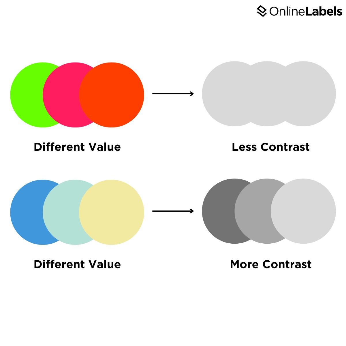
To see if your design has good contrast, change it to black and white. This will reveal which parts are more noticeable and if it need more contrast and value in certain areas.
Choosing Between Two Color Palettes
When designing a sticker, you can use two color palettes: complementary and analogous palettes.
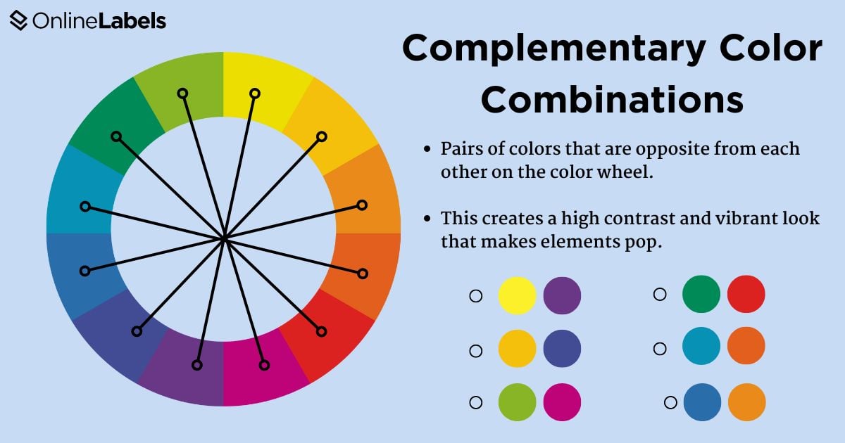
Complementary Color Palettes
These usually refer to colors opposite to each other in the color wheel. These pairings create high contrast and vibrant designs, making each other appear more intense
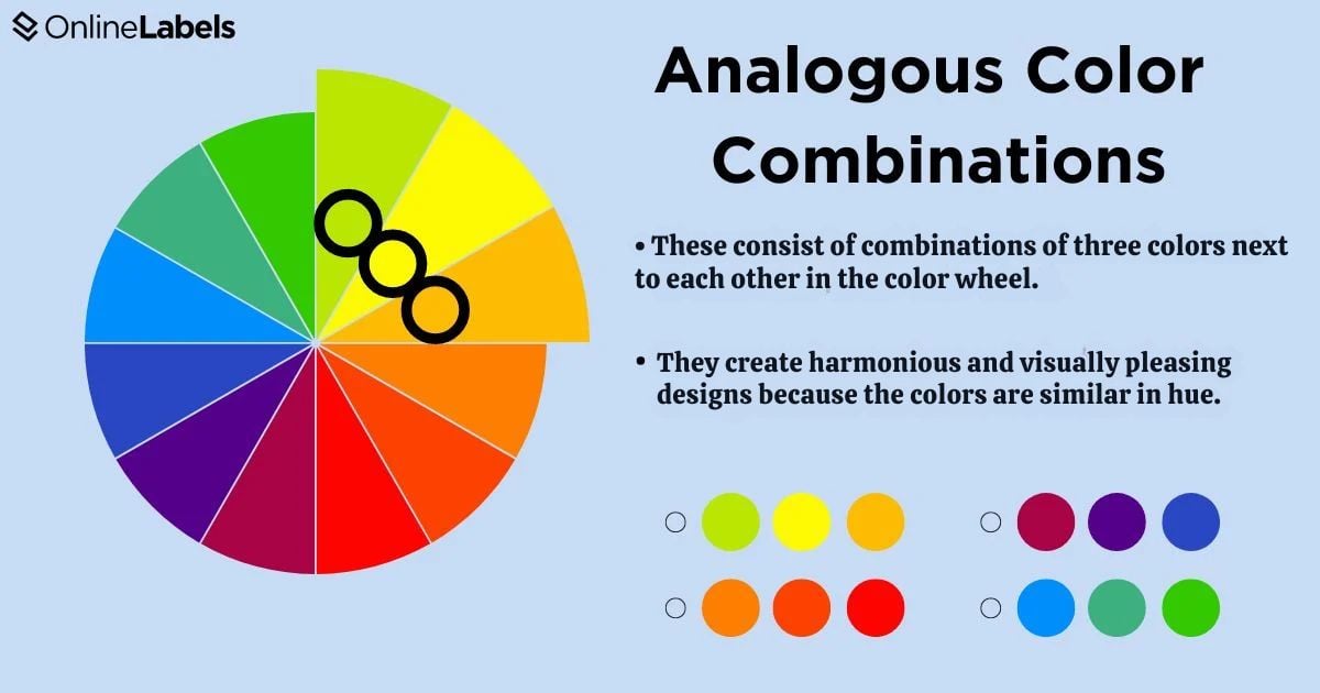
Analogous Color Palettes
These colors sit next to each other on the color wheel and offer a harmonious and monochrome look to the design, making it perfect for balance and fluidity.
Tip: If you’re starting in the world of sticker design, choose a limited color palette. This will help eliminate excessive color saturation and make your design look more professional.
For more information on color theory, check out our article on color psychology.
How to Find the Perfect Color Palette for Your Design
Do you need help figuring out where to start with your color palette? Or are you bored of using the same colors for your design? We got the best tips for you to get inspired!
Check Pinterest Color Boards
Many creators on the Pinterest platform come up with different color combinations and designs.
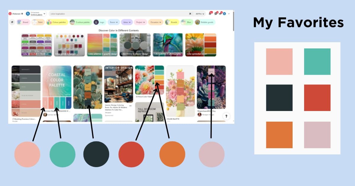
You can browse color combinations curated by Pinterest users to get an idea of which colors work best together.
Finish the Line Art Before Adding Color
One good tip is to finish the line art before adding color. This will help determine which palette best suits the sticker's design and aesthetics.

How to Choose The Best Fonts for Your Design
The right font can distinguish between a business that looks professional and one that doesn’t. Designers often struggle to choose the right font, but these tips can help:
1. Use the Same Fonts in All Your Brands
Your font must be visible in product logos, stickers, social media posts, and other marketing materials. This can increase your business' visibility and help it look more professional and stand out compared to other brands.
2. Consider the Audience: Fonts Have Different Voices!
Sometimes, beginners choose traditional fonts like Helvetica or Arial without considering the type of voice or experience they transmit to an audience. Fonts can be divided into four categories:
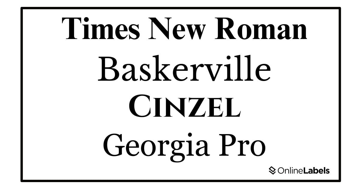
- Traditional fonts: which tends to transmit a more classic formal or conservative design. Some of the most used ones are Times New Roman, Cinzel, Baskerville, and Georgia Pro.
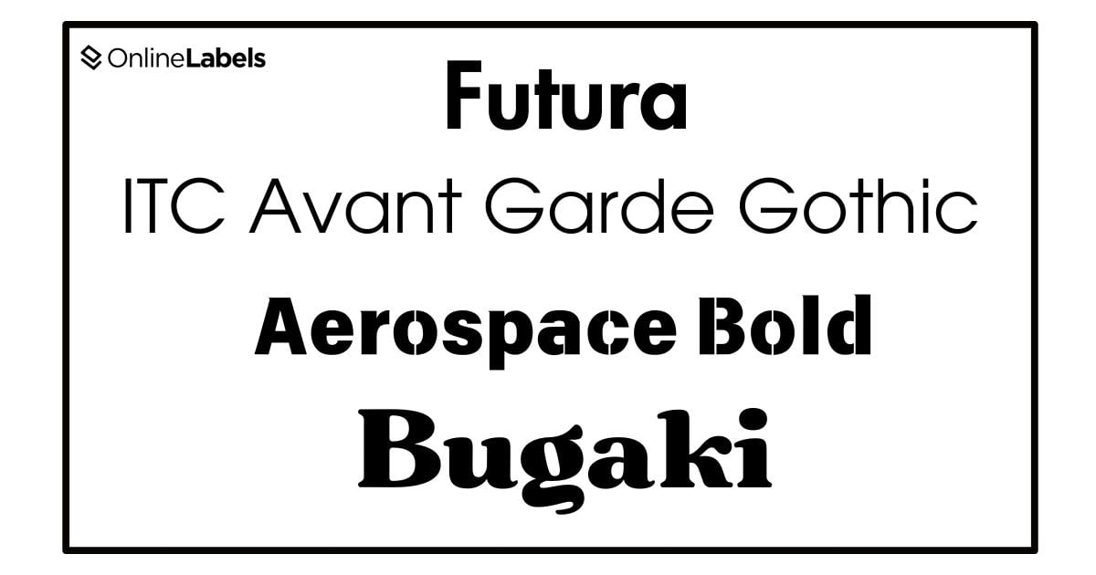
- Stability fonts: this is a widely recognized term in typography, which means that fonts are balanced but also transmit strength. These fonts have characteristics that make them appear more in severe or formal settings. Futura, ITC Avant Garde Gothic, Aerospace Bold, and Bugaki are the most common.
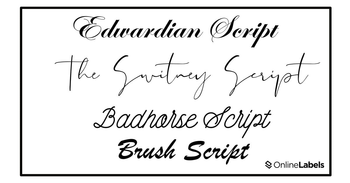
- Elegance fonts: refers to a typeface that shows sophistication, refinement, and beauty. These fonts are often used in formal invitations or luxury products, and the most common ones include Edwardian Script, the Switney Script, Badhouse Script, and Brush Script.
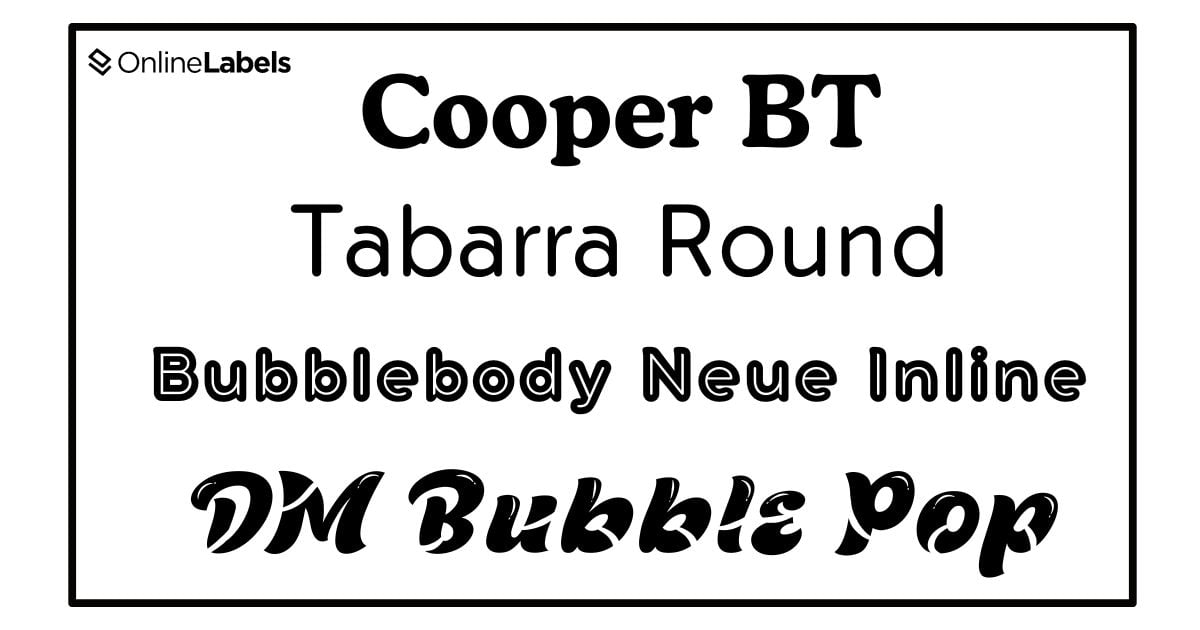
- Friendly fonts: this type of letter font transmits warmth, approachability, and welcoming vibes. These fonts are often rounded, playful, and easy to read. The most common ones include Cooper BT, Tabarra Round, Bubblebody Neue Inline, and DM Bubble Pop.
How to Use Fonts with Stickers
When designing stickers, the right font can make all the difference in effectively delivering your message. However, there are a few tips for choosing the right font for your business.
- Consider the readability: many fonts are perfect for transmitting a message in a sticker; however, their readability might change through different designs. So before choosing a font, ensure it’s readable from close and far away.
- Do not use too many capital letters: capital letters can transmit messages; however, since the stickers have limited space, they can become cluttered and hard to read.
- Pair fonts strategically: using more than one font can create a visually exciting design, but pairing them thoughtfully is essential. A good rule of thumb is to pair a bold font with a lighter font in a sticker design, like a serif font with a sans-serif font, to create contrast while maintaining cohesion.
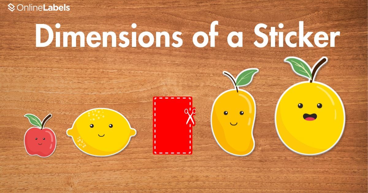
How to Determine the Dimensions of a Sticker
Selecting the correct dimensions for your sticker ensures it serves its intended purpose effectively. Many sticker sizes are available, but these five examples will give you a clearer understanding of common dimensions and how each size can be used effectively.
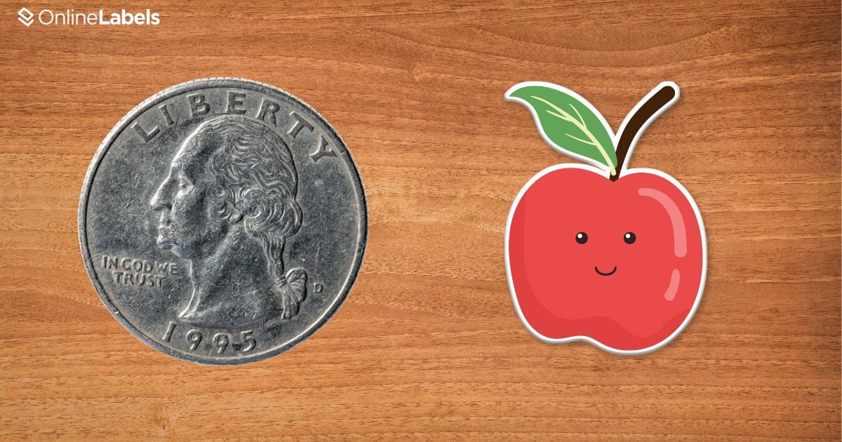
1" x 1" Stickers
They tend to be the size of a quarter. They are good for portraying a logo or a drawing; however, they have limited space to share large amounts of written information. However, they are perfect for social media handles and as logo stickers.
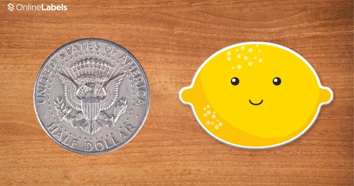
2" x 2" Stickers
This slightly larger size is typically more popular for branding, QR codes, and logos. There may be some space for short text like company names and social media handles.
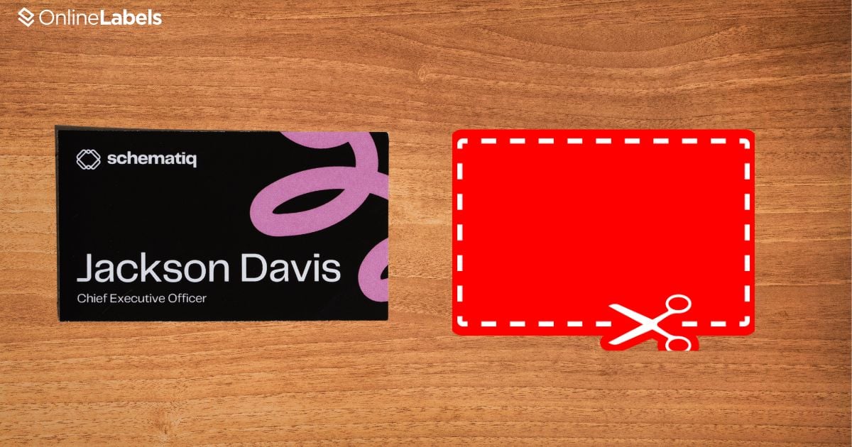
2" x 3.5" Stickers
They tend to be the size of a business card, which makes them ideal for stickers that carry more information.
4" x 6" Stickers
This is about the size of a photograph. Because of their larger size, they can display much more information or detailed graphics.

Designing Stickers Should Be Fun!
Creating eye-catching stickers requires a careful understanding of various elements, from color theory to font and size selection. Understanding these design fundamentals allows you to create stickers that stand out visually and portray the right message to your audience. Whether you’re a business owner looking to elevate your brand image or an artist creating custom designs, the power of a well-crafted sticker should not be underestimated. With thoughtful choices in the design process, the right color choices, and typography, your stickers can make a lasting impression wherever they are placed.