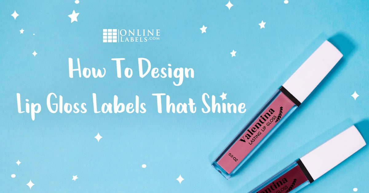
How To Design Lip Gloss Labels That Shine

You’ve put all the work into crafting the perfect lip gloss recipe — now all you need is beautiful lip gloss labels to top it off! But there is more to designing labels than just making them look pretty — you need to know what information the label should include and how to make it all fit to still look visually appealing, how to keep the design consistent with your brand, and more.
Most of the time, product labels are what attract customers initially, so you need to make sure that if you’re selling lip gloss, your labels will draw (and then keep) attention.
In this article, we’ll help you design labels that’ll attract customers, meet FDA guidelines, and look great against your lip gloss tubes.
Define Your Brand
Understanding your brand is an important step before you can start designing lip gloss labels. This is your opportunity to dress up your product with packaging that conveys your brand’s message and mission. And since the label is oftentimes the first thing consumers see when searching for products, it needs to leave a lasting impression that will convince them to buy from your brand.
When you keep your labels consistent with your brand, it also works to create a brand association in the minds of consumers — when they see your labels, they know it’s your product. So, your labels should be unique to you and your brand, and set you apart from your competitors.
If you haven’t already nailed down a brand identity, here are some questions you should answer to get you started:
- What is your "why?"
- Who is the ideal customer?
- What’s the story behind your business?
- What are your values?
- How does your product benefit customers?
- What makes your business unique?
- How do you want customers to describe their experience?
Once you’ve defined your brand, try to showcase it in your labels. For example, if creative colors or scents are important to your brand, you can get away with fun fonts. And if you want to communicate a high-end feel, make your labels look sleek and minimalistic.
Determine which colors, fonts, and other design elements you want to incorporate into your brand, and then use them consistently across all of your labels. What matters most is remembering how you want consumers to perceive your brand and then designing your labels to encourage that.
Determine Your Label Information
The next step is to understand what information you want to include on your labels, and what information you need to include. Once you have that figured out, you can determine the layout of your design and how you can size different elements.
You may not have realized that your lip gloss labels need to include certain information, but according to the FDA (Food and Drug Administration), they do. Lip gloss falls under the "Cosmetics" category, which is defined by the FDA as, "articles intended to be rubbed, poured, sprinkled, or sprayed on, introduced into, or otherwise applied to the human body...for cleansing, beautifying, promoting attractiveness, or altering the appearance."
Any cosmetic items that don’t follow the label requirements laid out by the FDA are considered "misbranded" and "may be subject to regulatory action," so it’s best to play it safe. To comply with the FDA requirements, the following information needs to be on your label:
- The principal display panel needs to indicate the name of the product (lip gloss)
- Net quantity of contents as a numerical count, measure, or weight, or a combination of weight/measure and numerical count
- Business information, including business name and address
- List of ingredients, arranged in descending order of their predominance or the quantity of each contained in the item based on metrics like weight
- Necessary warnings and directions for use
We know that feels like a lot of information to put on one small label, but you can make everything fit and still look minimalistic. Play around with font sizes, and choose a label size that wraps around the tube so you can put the ingredient list and other information around the back.
For more in-depth information about properly labeling cosmetics, check out our article on FDA labeling requirements for cosmetic products.
Design Your Labels
Now comes the fun part! After you’ve nailed down your brand, and determined what information you’ll include on your labels, it’s time to start designing. Here are some tips to get you started.
Choose a Label Size and Material
Once you have the label size picked out, it’ll make it easier to design your labels and get the exact look you want. To find the desired size, you may need to measure your lip gloss tube. Use this free printable ruler by cutting it out and taking the measurements of your tube.
As mentioned previously, consider going with a size that will wrap around the entire tube so you have ample space to display information without it looking crammed. If you go with this method, definitely make sure to use a clear gloss material, so customers can see that beautiful lip gloss color and shimmer! Note that ink prints transparent on clean materials, so you may need a white underprint to make them pop. Learn more about how to set up a white ink printing.
It’s standard to use a clear material for lip gloss products because customers need a sneak peak of the product before deciding to purchase. However, if a white material will fit your brand better, then make sure it doesn’t cover the entire tube.
Choose Your Design Program
There are an abundance of design services out there — and many of them are even free! A great option for your project is our own premium design software, Maestro Label Designer, which you get access to with any purchase from us.
It works with all of our templates, so you can see how your design will look on the label you selected. Import a blank template and design from scratch in Maestro, or start with a pre-designed template.
All of our pre-designed templates are professionally designed and can be fully customized, so they’re a great starting point. In Maestro, you’ll be able to make the template completely your own — edit and resize the text, add and edit elements, change colors, and so much more!
Add Visual Interest
Lip gloss is a unique product, because the product itself that can be seen through the transparent tube will do most of the talking — but don’t underestimate the power of labels! They still need to be designed in a way that will attract the eyes of customers and will be aesthetically pleasing. Here are a few design tips:
Patterns and Graphics
You don’t have much room to work with on a lip gloss tube, so patterns and graphics can go a long way. If your label is clear, play around with some patterns that have a lot of white space, if that suits your brand.
Colors
Sometimes simple black and white is best, especially for clear labels. But play around with colors and see which ones or which combinations of colors suit your brand.

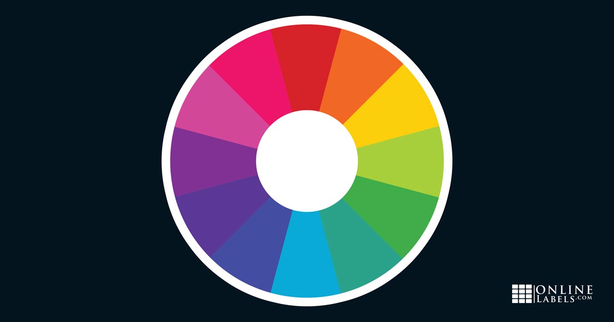
Here are some color schemes that create visual interest:
- Complementary colors: colors on opposite ends of the color wheel, like blue and orange. They have the effect of making each other pop.
- Split complementary: instead of two opposing colors, it splits one of the colors into 2. For example, green, red-magenta and blue-magenta. These give the same effect as complementary colors but give more flexibility when designing.
- Analogous: colors near each other on the color wheel. For example, yellow, yellow-green, and green. Analogous colors create a soothing and visually-pleasing effect.
- Monochromatic: multiple shades of one color. For example, light blue, blue, and dark blue. This color scheme is usually very aesthetically pleasing.
Keep in mind that you can play with these color combinations using the color of the lip gloss itself!
Fonts
A font can make or break a label, so choose one wisely. They can either do a lot to support your brand message, or totally distract customers. For example, if you want to portray a high-end brand feel, a modern and sleek sans serif font would go a long way.
Avoid using clashing fonts or combining too many different fonts. You probably don't want more than one bold and playful font in a single design. Unique fonts are ideal for headlines because customers' eyes are drawn to what stands out.
Create a Nice Composition
White space is a crucial design element in visual arts, and that includes lip gloss labels. White space, also known as negative space, is the undesigned area in between elements. Without enough white space, your design will overwhelm and confuse customers. Utilize it by strategically placing elements in a way that will guide the viewer’s eyes through your design. It’s also used to group elements together, and isolate important ones.
We hope this article was helpful for you as you start designing your lip gloss labels. Remember to take your time finding the style that matches you and your brand best, and if you’re having a creative block, a simple google search may give you the inspiration you need!


