How to Create the Best Labels and Packaging Using Color Psychology [Infographic]
It's been said that the way to connect with customers is through their hearts, not their wallets. What better way to start that relationship off on the right foot than through your product packaging?
Understanding the role of color in packaging and labeling could be the next step in creating a consumer connection and increasing your bottom line. To help you do just that, we've created this color psychology infographic and guide explaining the emotions each color is said to convey and how you can use them in your label designs.
Color Symbolism
Applying color psychology to your label design is an easy way to make your brand and product stand out in the marketplace. Learn more about the feelings each color represents in this helpful infographic.

Mix and Match Colors
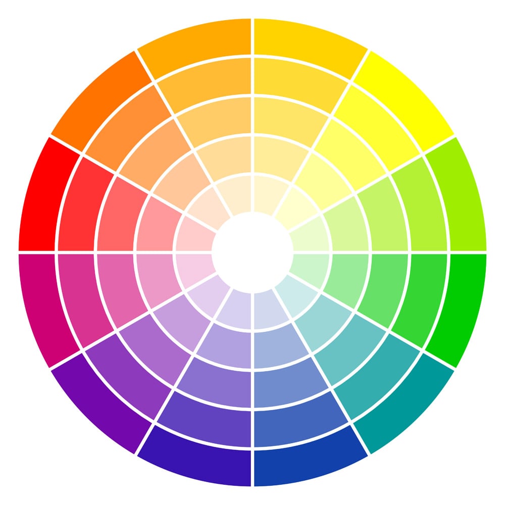
You may recall that complementary colors are those directly opposite each other on the color wheel. Analogous colors, on the other hand, are colors next to each other on the color wheel. Here are three fast tips when it comes to choosing colors for your product label:
Tip 1
Using complementary colors creates the most contrast, thereby making elements "pop." Keep in mind that while it is advantageous for specific graphic elements or content, it can be overwhelming in large doses.
Tip 2
Analogous colors create relaxed visuals that flow together. Instead of making aspects stand out like complementary colors do, these create a subdued feel and blend together. Consider using them solely in the background so the text is differentiated and clear from the design.
Tip 3
Follow the rule of threes when picking your color palette. According to Alan Dundes, professor of anthropology and folklore at the University of Southern California at Berkeley, Americans are primed to see things in threes.
Three is deeply rooted in today's culture and primes us to believe that things that come in threes are funnier, more satisfying, or more effective than other numbers of things.
Play with the Paper Color
You don't have to rely on your design to make your label something special. There's a world of options out there — labels are available in a variety of materials, too.
Consider how a full-color label can help increase the perceived worth of your product and the influence of these different materials. For some basic uses and associations of uniquely colored label paper, we've got you (and your products) covered.
Pastel Labels
When white is added to a pure color, the result is a lighter and paler version. While these pastels aren't as intense as their predecessor, they serve a uniquely different purpose. Pastel colors evoke openness and lightheartedness, as well as come across as soothing. They are also often associated with femininity and springtime.
Browse our pastel labels and get your creative wheels turning.
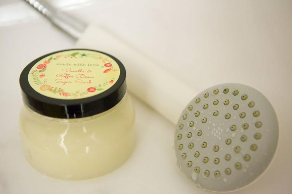 Floral Wreath pre-designed template printed on OL350YX.
Metallic Labels
Nothing is more eye-catching on a display than something shiny. Our silver and gold metallic labels radiate quality, making them an ideal option for marketing your premium product. Try using silver to signify glamour and sophistication. Silver is also often associated with water, in conjunction reducing anxiety and bringing harmony mentally, physically, and emotionally.
Gold, while also associated with sophistication, is more symbolic of luxury and quality than its counterpart. Gold is also said to be more masculine. Check out our metallic label collection to see how it can work for you or shop our enterprise solutions custom metallic / foil labels for large quantity orders.
 Elk pre-designed wine label template printed on OL162SF.
Fluorescent Labels
Fluorescent colors, commonly referred to as neons, are great for capturing that extra bit of attention. If you're looking for an upbeat, happy, and loud personality for your product packaging, you've found it with these labels. While best in moderation, fluorescents bring their own light to product packaging and can be very stylish.
Perk up your packaging with our fluorescent label assortment.
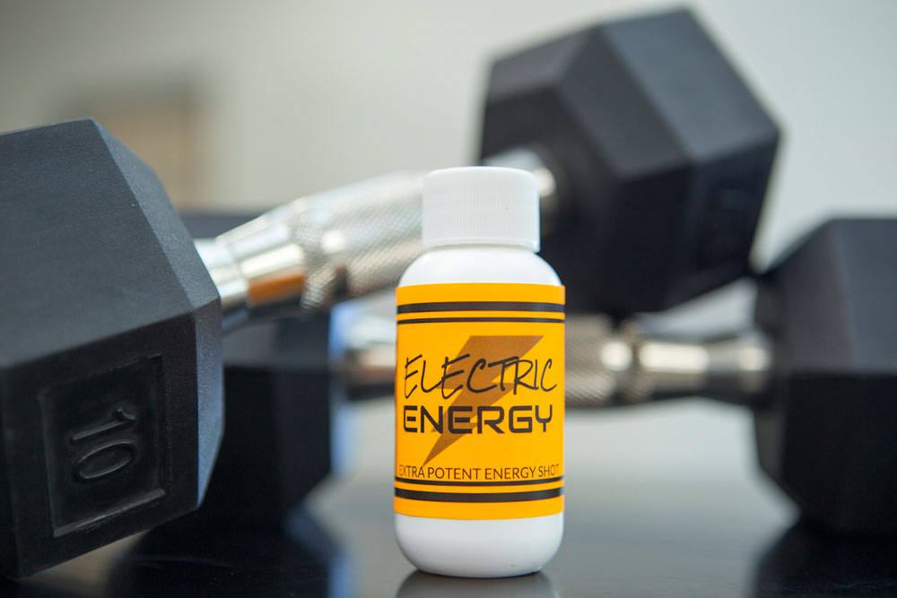 Printed on OL394FO.
Brown Kraft Labels
For the handmade, natural, or rustic effect, brown paper is as authentic as it gets. The earthy color can help your product really stand out and is perfect for driving home that made-with-love feel. These labels are also equated with the reliability and comfort that brown represents, and the joyous season of fall. Not to mention that if your company works with cardboard, these labels blend right in, creating a seamless appearance.
Share the love with our brown kraft label material.
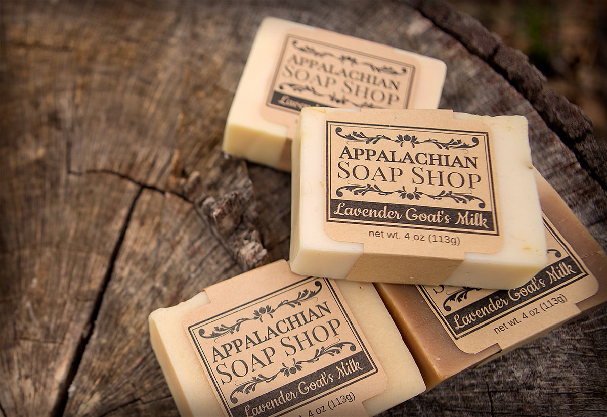 Apothecary Style Soap pre-designed template printed on OL1030BK.
Clear Labels
If you want your product or packaging to be at the forefront, a clear or transparent label may be the way to go. The minimalistic approach is a modern trend and an easy way to show your customers that the product is what really matters.
It also communicates openness and transparency in your business. Use the labels to communicate those sentiments while letting the beauty of your product do the talking. Clear labels work wonders in combination with beauty/cosmetics and food products. Take a look at our clear labels.
Before you start designing, consider the affect of your container type and background. Check out these examples of clear labels in a variety of different applications.
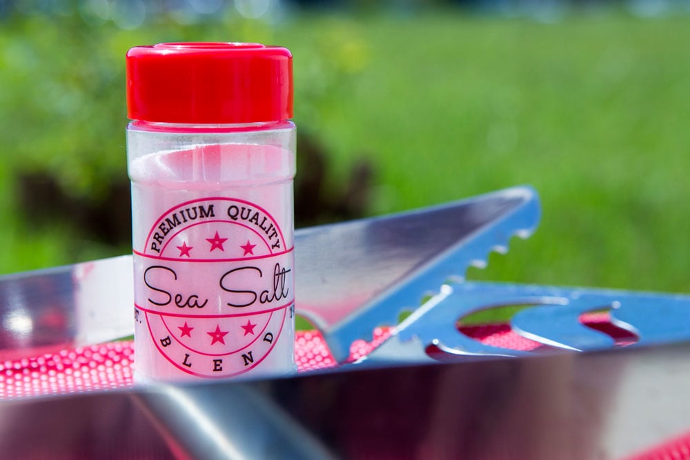 Retro Seasoning Bottle pre-designed template printed on OL125CL.
Be a Trendsetter
Some of the best successes come from always being one step ahead. If you see a trend on the horizon or want to be a trailblazer, beat your competitors to the punch. Implement bursts of neon or pastels by using a different color label, for example. Or change the color palette from analogous to complementary in Maestro Label Designer. Even little things such as playing with the font or adding a pattern can affect the label's performance.
While color theory is a science, it isn't black and white and your consumers might surprise you. Know that there's no harm in taking a trial run. Try selling a small batch of your big idea or variations of your original product label before going for it all the way. What you see in your head may not convert well to paper whereas an idea you're skeptical of may translate beautifully. A rebrand can involve a lot of work, and you want to make sure more work equals more sales.
This is a good opportunity to get customer feedback! Share the design on social and see what people are saying. Do they like the new look? Does it better communicate the personality of your brand and product? Does it stand out more in your displays? Those are all things to consider throughout the process.
There's a whole psychology behind packaging label design and we're just scratching the surface. We hope we've given you insight into packaging and perceived value.
Now, shop our selection of colored labels or take another minute to learn more about designing product labels.


