Thinking About Switching to Brown Kraft Labels? Read This First


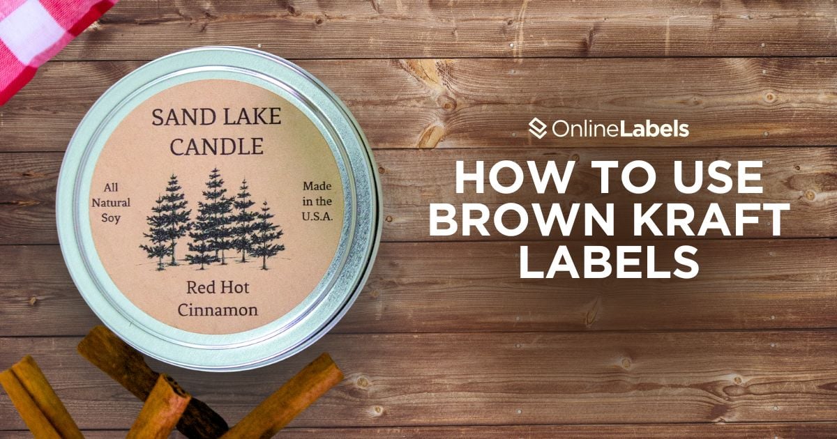
If you're transitioning your product or brand to a more handcrafted aesthetic, then Brown Kraft labels are the best fit for you!
This is one of our popular choices for a good reason since they offer a natural look and provide a rustic and organic feel for your brand. However, if you're thinking of transitioning from white labels to Brown Kraft, you must understand precisely what changes (both in design and production) are necessary when creating your labels.
White Labels vs. Brown Kraft Labels
When choosing between white and Brown Kraft labels, the correct option isn't just about color, but also about aligning your product with your brand identity. Both materials can successfully serve these topics in very different ways, not just in aesthetics but also in composition and packaging goals.
Finish and Texture
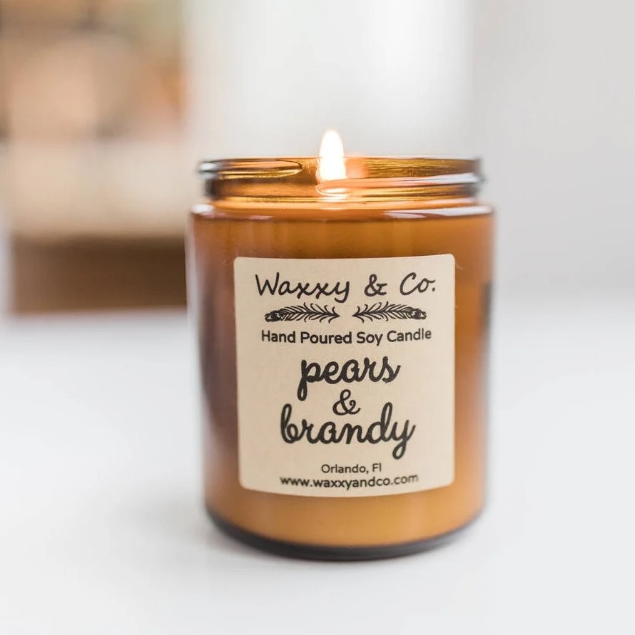
- White labels: normally feature a smooth, coated finish, available in both matte and gloss, that helps vibrant colors look more vivid in products
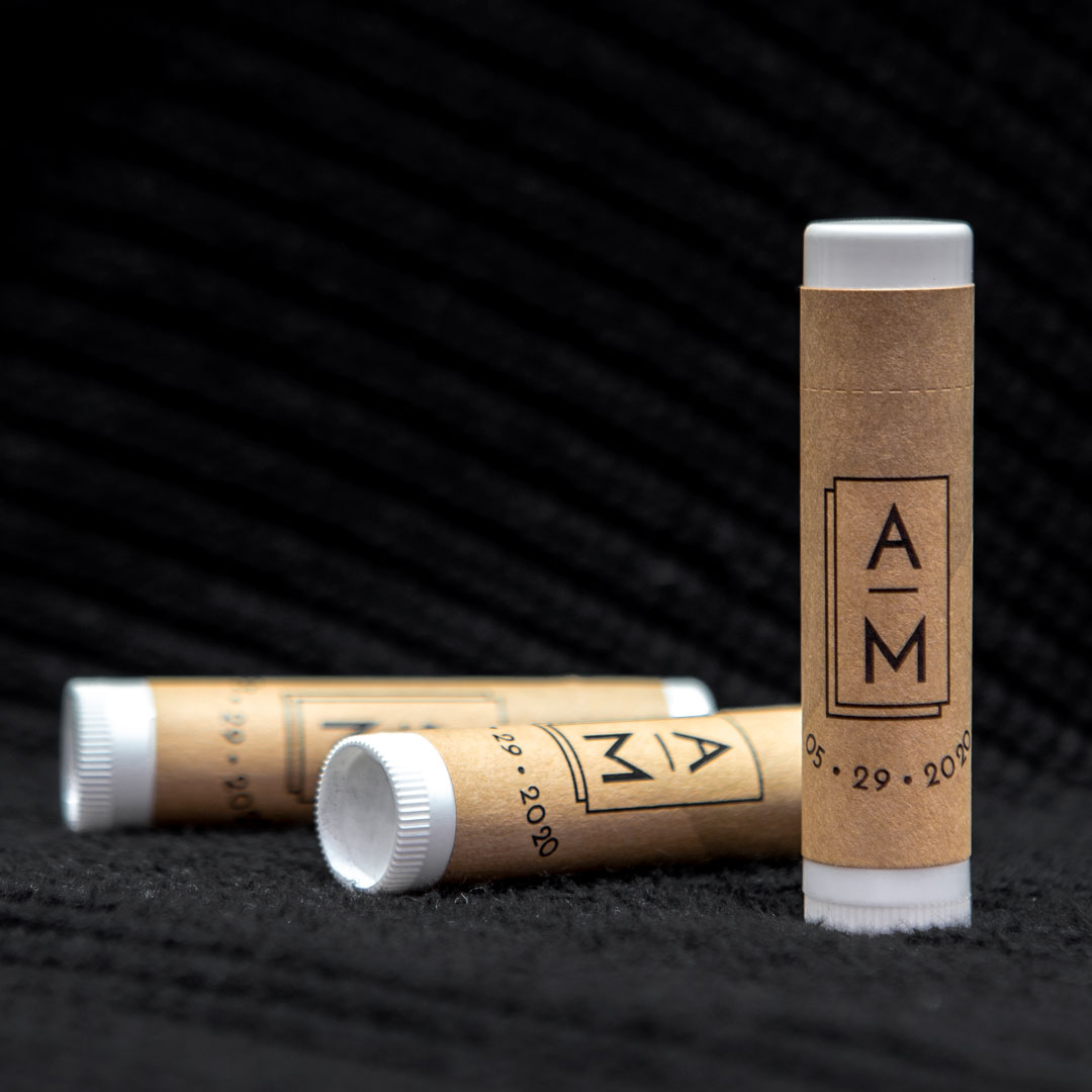
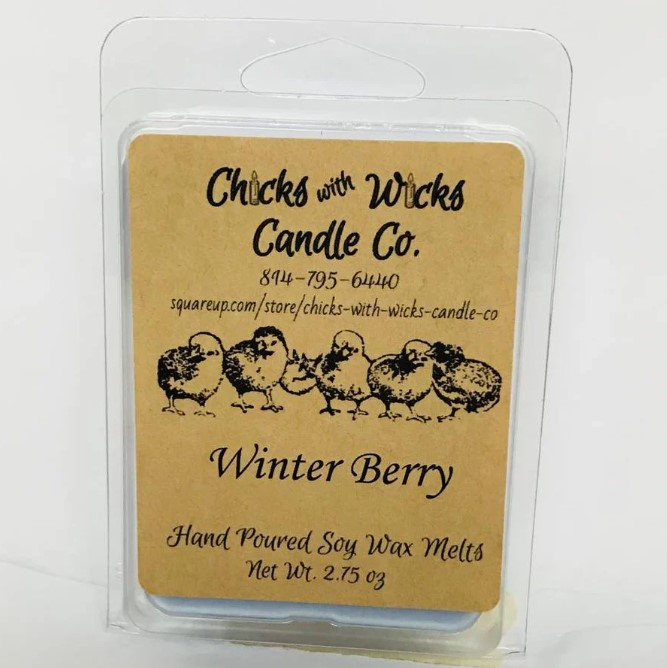
- Brown Kraft labels: they have a matte, uncoated, textured surface, which gives them an organic, raw feel. This material is perfect for products that want to portray a sense of craftsmanship.
What Can You Gain from Brown Kraft Labels?
Brown Kraft has many advantages when it comes to texture and colors. Here's what you gain when you make the switch:
1. No Fingerprints
Labels with a gloss coating can be susceptible to fingerprints. Brown Kraft labels stay clear even after being handled multiple times, which is especially helpful for products such as soaps, creams, etc.
2. Low-Saturation Design Looks Better with Brown Kraft Labels
The artisanal look of Brown Kraft labels doesn’t compete with your design; instead, it supports the visuals within it!
Because this material works well with negative space, its natural tone allows the elements in your logo (product name, ingredients, etc.) to take protagonism without needing other visuals or colors.
3. It Solves the “Overdesigned Label” Problem
If the elements in your design feel crowded, Brown Kraft can be the solution!
Because the material has a presence of its own, effects, gradients, or excessive branding can be reduced, making the overall result more minimalistic and professional.
Brown Kraft Design Constraints (and How to Overcome Them)
Designing for Browk Kraft labels is not always a straightforward process. For that reason, we've summarized the most common pain points of this material and how to work around them:
1. Color Absorption and Dulling
Even though Brown Kraft labels receive ink and toner well, colors can appear muted. This makes colors like light pastels or bright hues not show up as intended.
Solutions:
- Use high-contrast colors like black, deep greens, etc. Go with bold and saturated colors for better visibility.
- A white underprint can be a good way to show tones using other colors. Contact our customer service department at 1-888-575-2235 for more information.
2. Limited Image Clarity
Photos and specific images can get lost against the textured and brown background. Elements such as faces, lines, or details might not appear clearly as they do against a white label.
Solutions:
- Simplify your design, use bolder lines, thicker tones, and high-contrast graphics, and test print before committing to a full run to ensure everything pops.
- Use white underprinting to show images or elements of a particular color or element. For more information, contact our customer service team at 1-888-575-2235.
3. Brown Kraft Labels Are Not the Most Durable
Even though Brown Kraft labels have a permanent adhesive, they are not weatherproof. They are uncoated and absorbent, which means moisture and oils can damage them.
Solutions:
- Add a laminate: apply an overcoat spray or a laminate over your labels after printing. Our Clear Gloss Laser labels act as a great weatherproof laminate; however, the textured surface of the labels will be covered. An overcoat spray can add durability to your label while keeping the texture.
- Adjust printer settings: set your printer settings to "medium" or "low." High-quality print settings can oversaturate your paper.
Brown Kraft Label Application Mistake
Positioning a Brown Kraft label incorrectly can lead to peeling, bubbling, or uneven finishes. Overhandling the back of the adhesive can transfer oils and reduce its stickiness, leading to corner lifting or full-on peeling. To prevent this:
- Ensure you have clean hands and the application surface is free from debris.
- Press the label’s center first, then start applying the corners. This reduces some of the tension on the ends of the label, which will help it stay down.
- Apply pressure when you stick the label to the surface. Brown Kraft labels are pressure-sensitive, meaning the more pressure you apply, the stronger the durability.
- If the application includes a device that provides full-coverage printing, leave the bottom side of the overlap unprinted. The ink and the toner can make it difficult for the adhesive to bond fully.
For more information on how to apply labels and prevent damage, check out our full guide.
Ready to Switch? Here’s What You Need to Do
Are you thinking about switching to Brown Kraft labels? Here are a few things to consider when designing a product to ensure your final product looks as good as possible.
1. Redesign using only black or dark ink
Since Brown Kraft has a natural tone, some elements won't appear as they do on white labels. Stick to black or darker ink colors to ensure your design has a stronger contrast.
2. Print a sample
Before printing a whole batch of label products, make one mockup to see how the design looks with this new label material.
3. Think about laminating
If your products are exposed to exterior conditions, consider a laminate that can help them be more durable and weatherproof.
Ready to Switch to Brown Kraft Labels?
Switching to Brown Kraft can completely transform how your product looks and feels, giving it a more natural, handcrafted, and intentional appearance. Whether you're updating your brand's visual identity or launching a new product line, testing your design, choosing the right print methods, and preparing your materials properly will ensure your Brown Kraft labels look professional and perform as expected. For more inspiration and tips on how to use Brown Kraft, check out some of our customer examples.