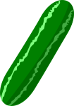
Pickle Remix
Clip Art Details
- Dimensions: 348 x 1,000 pixels
- File Size: 179 KB
- Downloads: 1,495
- Creator: evilestmark
- Date Added: 2/24/2016
- Categories/Tags: cucumber, food, green, pickle, vegetable
- Images From: http://openclipart.org/
- Description: A little bit more pickled than the original... I brought out the center point of the gradiant to make it stand out a little more, also increased the border width by 0.5


